
NOTE This page needs updating
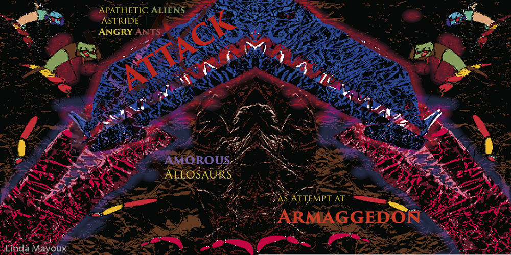
Doggerel: Apathetic aliens astride angry ants attack amorous allosaurs attempting Armageddon
Media: alluminium foil, Adobe Photoshop airbrush and acrylic.
Style: Sort of Aztec, african, arabic mix – but I can push this further in future Photoshop revision of the alligators.
Assessment of the spread so far
My general feel for the letter A is a combination of arches receding (to light? to dark?), aggressive clashes of sharp diagonal forms and little twirly things that are a bit annoying – though they can have ‘attitude’. I really like the sharpness of the original Phoenecian forms – they are inverted.
I am quite pleased with the image so far. I like the general shape and textures, and the apathetic aliens. I want to make the heated lovemaking more vivid through more layering in Photoshop to make the jaws interlock, and add some lighting effects. I want to add back some stinging tails in a different colour on the ants. I still need some work on the letter page – so many possible combinations of layer order, colour and effects. The Armageddon image bottom left needs to bring out the A shapes more, and I need to review the blending and colours.
As with all the images I need to work out how to make the doggerel stand out more clearly from the background.
Original doodles
This letter was where my ideas started for ‘A is for Attitude’ based on experiments with letter forms and collage in Assignment 3.


Brainstorm sketch
As I was starting this Assignment I did a large A2 brainstorm sketch to think about other shapes and words, later consulting the Adobe Typeface sheet below.

This led to ideas for doggerel. I brainstormed then looked up the possible media and styles.
Doggerel versions: Angry/arrogant/apathetic/athletic? aliens/athletes astride angry/arrogant/apathetic? ants attack amorous alligators/anacondas/allosaurs as attempt at Armageddon
Media and materials: Acrylic, Aluminium foil, Airbrush, Arches watercolour paper, acetate
Style and mood: Aztec, African, Arabic, Aboriginal, abstract, angular, angry, amorous, apathetic
Initial Procreate digital sketches
I looked up the colours and when I was travelling I did some colour ideas in Procreate on my iPad.


Angry Ant and Alien sketches and scans
I then went back to my brainstorm sketch, and an A4 sketchbook to work more on the various images of ants and aliens.


Alligator shapes and sketches
I then turned to the alligators that in the end became allosaurs. These developed by accident as I was tearing up the foil for Armeggedon below, and I noticed some of the shapes that started to look like male or female alligators, so I played around a bit with this idea and did a number of different scans, crops and inversions.


Foil Armaggedon
I also experimented with different ways of incising shapes into the aluminium foil with the intention of painting over with acryllic paint. I first explored scanning, then working with the scans in Photoshop. But in the end I may paint over with acryllic to really bring out some of the shapes before going to Photoshop.


Page spread variations
I then started to do mockups in InDesign. Experimenting with different layouts, orientation of the image, and designs for the letter page. This was done after I had worked on many of the other images, and the change in the concept of the book from ‘A is for Attitude’ to ‘A is for…’ and the greater emphasis now placed on the images. I also decided I would make the letter pages design based, and omit the text. This was partly because the text was becoming rather boring when I tried to put it on all the pages – too much like a school book.


Final images


Research
Colour chart

A in Illustrator Typefaces


Development and use of the Letterform
Edited and extended from:
The letter ‘A’ or aleph (also written ‘aleph) was the first letter of the Phoenician alphabet, representing a glottal stop. Aleph is the first letter of the Semitic abjads, including Phoenician ‘Ālep ![]() , Hebrew ‘Ālef א, Aramaic Ālap
, Hebrew ‘Ālef א, Aramaic Ālap ![]() , Syriac ʾĀlap̄ ܐ, and Arabic Alif ا.
, Syriac ʾĀlap̄ ܐ, and Arabic Alif ا.
The name aleph is derived from the West Semitic word for “ox”. In Modern Standard Arabic, the word أليف /ʔaliːf/ literally means ‘tamed’ or ‘familiar’, derived from the root |ʔ-l-f|, from which the verb ألِف /ʔalifa/ means ‘to be acquainted with; to be on intimate terms with’. In modern Hebrew, the same root |ʔ-l-f| (alef-lamed-peh) gives me’ulaf, the passive participle of the verb le’alef, meaning ‘trained’ (when referring to pets) or ‘tamed’ (when referring to wild animals).
The shape of the letter A derives from a Proto-Sinaitic glyph that may have been based on a Egyptian hieroglyph, styled as a triangular head with two horns extended. By 1600 B.C.E., the Phoenician alphabet letter had a linear form that served as the base for some later forms.
| Egyptian | Cretan | Phoenician aleph |
Semitic | Greek Alpha |
Etruscan A |
Roman/Cyrillic A |
Boeotian 800–700 BC |
Greek Uncial |
Latin 300 AD Uncial |
|---|---|---|---|---|---|---|---|---|---|
 |
|||||||||
When the ancient Greeks adopted the alphabet, their language had no glottal stop so they used their version of the sign to represent the vowel /a/, and called it by the similar name of alpha. In the earliest Greek inscriptions after the Greek Dark Ages, dating to the 8th century BC, the letter rests upon its side, but in the Greek alphabet of later times it generally resembles the modern capital letter, although many local varieties can be distinguished by the shortening of one leg, or by the angle at which the cross line is set.
The Etruscans brought the Greek alphabet to their civilization in the Italian Peninsula and left the letter unchanged. The Romans later adopted the Etruscan alphabetto write the Latin language, and the resulting letter was preserved in the Latin alphabet that would come to be used to write many languages, including English.
Typographic variants
Typographic variants include a double-storey a and single-storey ɑ.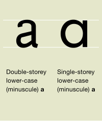
Different glyphs of the lowercase letter A.

Typographic Development
During Roman times, there were many variant forms of the letter “A”:
- monumental or lapidary style, which was used when inscribing on stone or other “permanent” mediums.
- cursive style used for everyday or utilitarian writing, which was done on more perishable surfaces including: majuscule cursive, minuscule cursive, and semicursive minuscule.
- intermediate variants between the monumental and cursive styles including the early semi-uncial, the uncial, and the later semi-uncial.
At the end of the Roman Empire (5th century AD), several variants of the cursive minuscule developed through Western Europe:
- semicursive minuscule of Italy,
- Merovingian script in France,
- Visigothic script in Spain,
- Insular or Anglo-Irish semi-uncial or Anglo-Saxon majuscule, of Great Britain.
- Caroline script which was very similar to the present-day form had developed by the 9th century, derived through a combining of prior forms. It was the principal form used in book-making, before the advent of the printing press.
15th-century Italy saw the formation of the two main variants that are known today. These variants, the Italic and Roman forms, were derived from the Caroline Script version. The Italic form, also called script a, is used in most current handwriting and consists of a circle and vertical stroke. This slowly developed from the fifth-century form resembling the Greek letter tau in the hands of medieval Irish and English writers. Most printed material uses the Roman form consisting of a small loop with an arc over it (“a”). Both derive from the majuscule (capital) form. In Greek handwriting, it was common to join the left leg and horizontal stroke into a single loop, as demonstrated by the uncial version shown. Many fonts then made the right leg vertical. In some of these, the serif that began the right leg stroke developed into an arc, resulting in the printed form, while in others it was dropped, resulting in the modern handwritten form.
Italic type is commonly used to mark emphasis or more generally to distinguish one part of a text from the rest (set in Roman type). However, there are also some other cases aside from this where script a (“ɑ”), also called Latin alpha, is used in contrast with Latin “a” (such as in the International Phonetic Alphabet).
 Blackletter A |
Uncial A |
Another Blackletter A |
 Modern Roman A |
 Modern Italic A |
 Modern script A |
