
In this exercise I used the images to print at least 16 pages onto the paper samples from Project 4.1. I compiled these into a sketchbook for comparison. I chose an old, cheap and yellowed small Sketchbook for this – just because I liked it. The slightly fusty smell of the pages, and the size which stopped me being too methodical and mechanical in my comparisons.
I chose to use my inkjet printers for this. I had already completed the OCA Printmaking 1 course, and was intending to use some new printmaking techniques like Woodcut in the Assignment 4 Altered Book. I had so far used inkjets only for ‘straight’ printing, and wanted to fully explore their potential for creativity.
Paper qualities and mood
Initially I had thought this part of the project would be fairly straightforward – trying to match the ‘feel’ of different types of paper like different types of Inkjet art paper or photographic paper with the feel I was trying to convey with the images. Then collaging, or overprinting.
I did make some interesting discoveries on the effects of different paper qualities on the mood of the image – leading me to think carefully about what sort of mood I was trying to convey in each image.
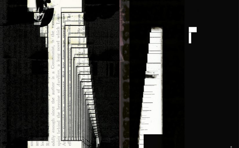
In the images below some Inkjet art papers gave a crisp moonlit and magical feel. Others on older paper look more like woodcut or – as one would expect – an old book with all its romantic feel.


In other cases the difference in clarity between the papers is something that could be juxtaposed on a spread in order to vary the mood or suggest a narrative.


Some images work very well over text – particularly if the text is vertical. In some cases the text, and its specific placing is important and needs to be planned. I others the random nature of the associations between the image and text can spark new interpretations of both.


Some papers like the silver grey paper used in the image below have a very soft, watercolour sensitive feel.

Active experimentation and ‘happy accidents’
However as I tried the different types of paper, particularly when I was in a rush I made many mistakes. I have two inkjet printers – one large A3 3 in 1 printer with scanner and copier that I use for work, and one very small portable one. They each have very different mechanisms and also software that I kept getting confused – putting in paper back to front or upside down. This led to some quite interesting juxtapositions when I tried to print images on two sides of the paper.
My mistakes also led to discoveries of new possibilities eg


Final Scanned Images


How these images were organised into a narrative and bound is described in the next project.
Project 4.4 Collating and Binding
