
TASK
The brief
Using DTP software, recreate a double-page spread from a magazine.
Research
Find a magazine double-page spread that you find interesting. Make sure it has several columns of text and includes photographs, headings, subheadings and folios. Measure the margins, column width and depth, plus spaces between the columns.
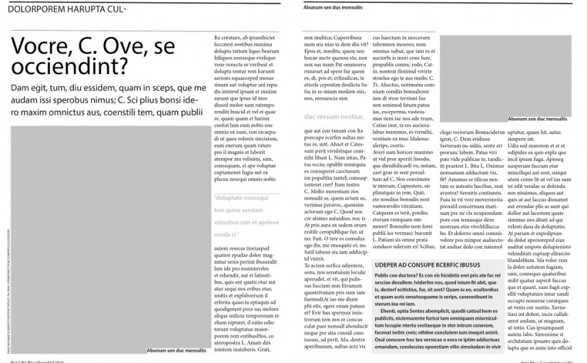
For this exercise I considered articles from various Design magazines. But generally these were longer articles that needed to be considered together. Their grid structures also seemed much more complicated. In the end I chose a short article from New Scientist.
Development
Trace the grid structure of your chosen double-page spread using tracing paper and a sharp pencil. Transcribe the tracing onto a clean sheet of paper, drawing on the measurements.

I found this exercise a little tricky because the paper shifted over the fold. Also the thickness of the pencil lines easily threw things out. Then also to get measurements within 1mm seemed to differ between my rulers and/or my precise angle of view. I had to measure from column edge to column edge and then estimate the gutter – fixed at 2mm.
Now recreate the same double-page spread using DTP software. Use your traced drawing measurements as a guide. There is no need to copy out all the text – you can use ‘dummy’ text or ‘blurb’ such as lorem ipsum. Similarly, there is no need to recreate the images – indicate images by a 10% shaded area, whether these are cut-out, full-bleed or within a box. Try to match the typeface as closely as possible. It doesn’t need to be exactly the same, but try to retain something of the original – for example, make sure you use a sans-serif font if the original is sans-serif.
I used InDesign. I found it easier here to set things up with 4 columns and equal gutter than through measuring on the tracing paper. I liked the heading font, but matching it was not possible – I tried identifont but the text was short and there were not enough capital letters. None of the fonts it suggested looked much like the original, so probably a specialist font for that magazine. So I used Minion and Myriad. But as far as possible I matched the relative sizes, weights, caps, baseline and leading values.
Present
Present your finished double-page spread accompanied by your developmental notes in your learning log.

click here for pdf of layout and original article
Click here for the beginnings of my exploration of different grid possibilities pdf
I intend to extend these explorations much further drawing on:
- Muller Brockman Grid Systems in Graphic Design
- Samara Making and Breaking the Grid
- Noble and Bestley Experimental Layout
