NOTE This page needs updating
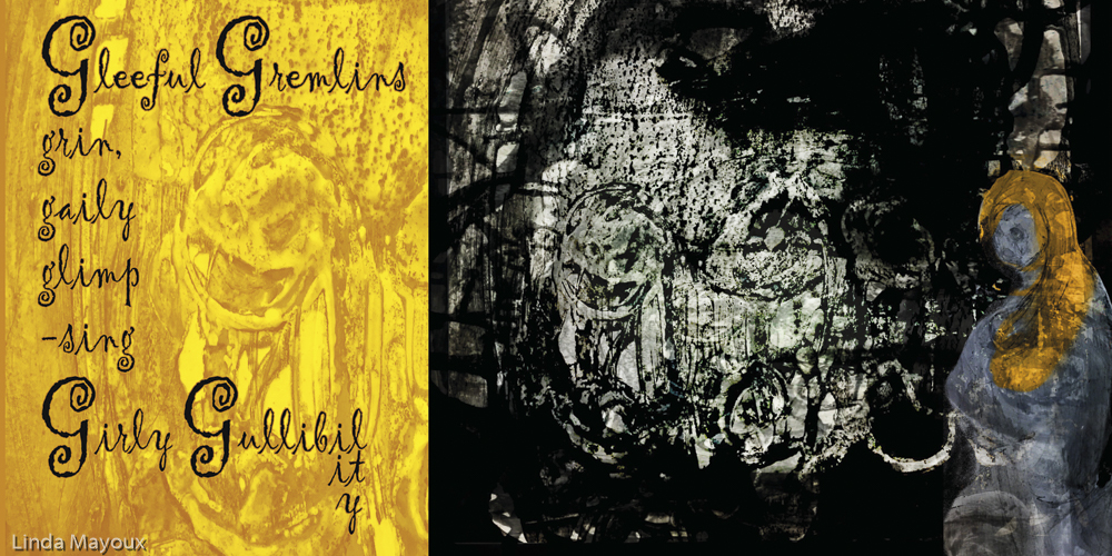
Doggerel: Gleeful gremlins grin greedily, glimpsing gullibility
Media and materials: Glue, graphite, gouache, gesso, gloss, grease, gold paper, graph paper, gloss paper, glassene, greaseproof paper, gampi
Style: gross, greasy, golden, glinting, grid, gravity
Initial ideas
Material experiments
Image development
Final image
Research
Colours
Adobe Illustrator Typefaces
Evolution of the letterform
Edited and extended from:
G (named gee /ˈdʒiː/) is the 7th letter in the ISO basic Latin alphabet.
In English, the letter appears either alone or in some digraphs. Alone, it represents
- (/ɡ/ or “hard” ⟨g⟩) – a voiced velar plosive , as in goose, gargoyle and game; ⟨g⟩ is mainly soft before ⟨e⟩ (including the digraphs ⟨ae⟩ and ⟨oe⟩), ⟨i⟩, and ⟨y⟩ and hard otherwise. But there are many English words of non-Romance origin where ⟨g⟩ is hard though followed by ⟨e⟩ or ⟨i⟩(e.g. get, gift).
- a voiced palato-alveolar affricate (/dʒ/ or “soft” ⟨g⟩), generally before ⟨i⟩ or ⟨e⟩, as in giant, ginger and geology. There are a few English words in which ⟨g⟩ is soft though followed by ⟨a⟩ such as gaol or margarine.
- a voiced palato-alveolar sibilant (/ʒ/) in some words of French origin, such as rouge, beige and genre.
The digraph ⟨dg⟩ represents
- a voiced palato-alveolar affricate (/dʒ/) as in bridge or judge.
The digraph ⟨ng⟩ represents either
- a velar nasal (/ŋ/) as in length and sing, or
- a consonant cluster of the latter with the hard ⟨g⟩ (/ŋɡ/) as in jungle and finger or
- a consonant cluster of /ndʒ/, as in sponge or binge.
The digraph ⟨gh⟩ (which mostly came about when the letter Yogh, which took various values including /ɡ/, /ɣ/, /x/ and /j/, was removed from the alphabet) now represents a great variety of values, including
- /ɡ/ word-initially and in loan words like spaghetti
- as an indicator of a letter’s “long” pronunciation in words like sigh and night
- silent as in eight and plough
- /f/ in enough
- between two vowels, a simple cluster of /ɡh/ as in pigheaded
The digraph ⟨gn⟩ may represent
- initially, /n/ as in gnome and gnostic
- finally, /n/ with a preceding “long” vowel as in sign
- between two vowels, a simple cluster of /ɡn/ as in signature
- /nj/ in loanwords such as lasagna
History
The range of typographic forms that the letter G currently takes have a number of different origins:
The letter ‘G’ was introduced in the Old Latin period as a variant of ‘C’ to distinguish voiced /ɡ/ from voiceless /k/. Hempl (1899) proposed that ‘G’ was a direct descendant of zeta. Zeta took shapes like ⊏ in some of the Old Italic scripts; the development of the monumental form ‘G’ from this shape would be exactly parallel to the development of ‘C’ from gamma. He suggests that the pronunciation /k/ > /ɡ/ was due to contamination from the also similar-looking ‘K’.
Typographic variants
Modern upper case ‘G’
to do
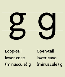
Modern lowercase ‘g’ has two typographic variants:
- single-story (sometimes opentail) ‘
 ‘ derived from the majuscule (uppercase) form by raising the serif that distinguishes it from ‘c’ to the top of the loop, thus closing the loop, and extending the vertical stroke downward and to the left.
 - double-story (sometimes looptail) ‘
 ‘ developed similarly, except that some ornate forms then extended the tail back to the right, and to the left again, forming a closed bowl or loop. The initial extension to the right was absorbed into the upper closed bowl. The double-story version became popular when printing switched to “Roman type” because the tail was effectively shorter, making it possible to put more lines on a page. In the double-story version, a small top stroke in the upper-right, often terminating in an orb shape, is called an “ear”.
Related characters
- ɢ : Latin letter small capital G, used in the International Phonetic Alphabet to represent a voiced uvular stop
- G with diacritics: Ǥ ǥ Ĝ ĝ Ğ ğ Ģ ģ Ɠ ɠ Ġ ġ
- ₲ : Paraguayan guaraní


