There is a lot of disagreement about ‘colour in Islam’. Some colours appear to be recommended or forbidden. But this often differs between Quran and Hadith and different Islamic sects. There is very rich use of colour in arts and crafts in Islamic cultural traditions and modern visual creativity.
Pan-Arab colours
White, black, green and red, dominate the flags of Arab states.
Green
Green (Arabic: أخضر) is considered the traditional colour of Islam.
The Arabic word for “greenness” is mentioned several times in the Quran, describing the state of the inhabitants of paradise. Reclining on green Cushions and rich Carpets of beauty — Sura 55, verse 76.Upon them will be green garments of fine silk and heavy brocade, and they will be adorned with bracelets of silver; and their Lord will give to them to drink of a Water Pure and Holy. — Sura 76, verse 21.Al-Khidr (“The Green One”) is a Qur’anic figure who met and traveled with Moses.
The Green Dome, traditional site of the tomb of Muhammad, was painted green on the order of sultan Abdul Hamid II (r. 1876–1909).
Green was used as the colour of the banners of the historical Fatimid Caliphate. The Umayyads fought under green and gold banners. Green is also used in several national flags as a symbol of Islam. These include: Afghanistan, Algeria, Azerbaijan, Comoros, Iran, Mauritania, Pakistan, Saudi Arabia. and Sri Lanka.
Black
The Abbasids chose black (blue) and fought under black banners.
It is often worn by Shi’ite Muslims, who mourn the death of Husayn ibn Ali, killed at the Battle of Karbala. Black cloaks are worn by the ayatollahs, the Shi’a clergy. In many Shi’a countries, a black turban is worn only by male sayids, men who descend from Muhammad through his daughter Fatimah and his son-in-law Ali.
Symbol of modesty in some Muslim cultures. It is the colour of the chador worn by devout Iranian Shi’ite women
Black is considered the colour of mourning in Western and Mediterranean countries. But this is seen as a Christian tradition.
White
The colour white symbolizes purity and peace.
Many Muslims wear the colour white when they attend Friday prayers and when performing sacred rites of pilgrimage.
In Sunni tradition, Muhammad wore a white kufi (head cap) with a black amaana (turban).
The Umayyads chose white for their battle standards when they fought the Abbassid during the Caliphate period
It has appeared on many Islamic flags since.
Red
Has no religious significance.
Some claim the hadith forbids the wearing of pure red clothing, it should be mixed with patches of other colours
Various countries on the Persian Gulf have chosen red flags
Blue and turquoise
many Islamic towns in the middle east, tend to have blue color? for example, the also many houses in sana city of yemen also painted the windows and the doors in blue color? even the villages in santorini Island of greece also painted in blue and white?………..the nazar bonjuk of turkey also in the blue color. Do you think is it possible that they painted the houses in blue, blue green, white and light yellow is because those soft colors are counteract the high color of the heat desert?
Turquoise
The colour turquoise greenish blue, has a special cultural place in Islam, though apparently not clear religious significance.
decoration of mosques and other buildings in Middle East: blue town of Chefchaouen in Morocco, blue town of Sidi bu Said in Tunisia, blue mosque and blue rooms in Topkapi palace of Turkey, blue in mosques of Isfahan and Shiraz in Iran
used in coats of arms, so that they could not possibly be mistaken for their Muslim opponents in the heat of battle.
Yellow
The yellow colour of gold symbolizes wisdom.
Brown
Brown is often believed to symbolize purity and peace.
Women are at the centre of the contemporary Saudi art scene, posing questions on the current political climate and women’s rights.
Alaan Artspace
Riyadh’s first curated contemporary art platform. The name Alaan, meaning ‘now’ in Arabic, is supposed to represent the energy and power of the prevailing art scene in Saudi Arabia. The exhibition shows works entirely created by women, who are both diverse methodologically and in terms of their artistic style. Further, the founder, creative director and chief curator are all women. The gallery also hosts master classes and workshops, organized by Sara Raza (the former curator of public programmes for London’s Tate Modern Museum), teaching prospective artists about contemporary art. Moreover, Alaan Artspace funds its non-commercial exhibitions, commissions new works and offers free non-profit educational arts programming through revenues from its shop, restaurant and café.
Manal Al Dowayan (1973) was born in Dhahran, the Eastern province of Saudi Arabia. Initially she studied Systems Analysis (MSc) and worked as a Creative Director in an oil company. She was working and producing art for 7 years until she became a full time artist in 2010. This was a result of an active art industry that was evolving in her region. Dowayan has rapidly become one of the leading advocates of contemporary artists in the Middle East. She studied abroad in a number of art institutions including USA, London, Dubai and Bahrain. She works mostly with photographs and installations and her work is largely feminist in nature. Her most revered piece is ‘Suspended Together’, a flock of doves made from fiber-glass with stickers on their bodies . The doves are interlocked and made up of permission slips that women in Saudi Arabia must have signed by their husbands or male guardians to have permission to travel.
An internationally acclaimed artist, she has exhibited her work at the Venice Biennial Collateral show “The Future of a Promise” in 2011 and at the Victoria and Albert Museum as part of exhibition that showcases their public acquisitions of Middle East Photography titled “Light From the Middle East” in 2013 and the American Biennial Prospect New Orleans in an exhibition titled “Notes For Now” in 2014 where she showed a collection of 20 photographs and 11 videos titled “If I Forget You Don’t Forget Me” she also participated in Fluid Form: Contemporary Art from Arab Countries (2010) in Seoul at Freedom to Create (2011) in New York and at Simply Words in Switzerland (2012)
Samiah Khashoggi, born 1958 in Abha, is an interior designer, painter, and organizer of Saudiaat, an art exhibition. In 1982, she graduated from Kingston University in the UK with a bachelor’s degree in interior design, and in 2005 completed her Masters of Fine Arts from De Montfort University. She is an assistant professor of interior design at Dar Al Hekma College. For a few years starting in 1983, she worked as the first female designer at her brother’s furniture and design company.
Working on her MFA required her to interview and organize an exhibit for local female artists. Her exhibition for her MFA turned into a regular exhibition called Saudiaat, featuring contemporary female Saudi Arabian artists. As well as featuring artwork, Saudiaat also supports local female artists and educates the public about the techniques involved in their work. As of 2012, the group has had four exhibitions, with the 2012 exhibition, titled “Directions”, having been held in Jeddah.
Nabatt: A Sense of Being (2010) is an exhibition of contemporary art from Saudi Arabia. It is presented by the Saudi Arabian Pavilion at the Shanghai World Expo. Amongst the artists exhibiting, it features works by Shadia & Raja Alem, Reem Al Faisal, Lulwah Al Homoud, Jowhara Al Saud, Noha Al-Sharif] & Maha Mullah. The show attempts at engaging with the diverse nature of life, notably human relationships and the interactions amongst and within social groups and communities.
Edge of Arabia
Edge of Arabia (2003) is a UK independent non-profit organisation, founded by an artist collective.
We Need to Talk: Jeddah
In January 2012, it organised a 40-piece exhibition entitled ‘We Need to Talk’. More than a third of the works displayed were by women.
Come Together: London
In October 2012, it presented ‘Come Together’ curated by Stephen Stapleton displaying large-scale, multi-media work by leading Arab artists. The name of the exhibition, Come Together was a reference to social networking channels and their influence on individual expression in the Arab World. The show featured the work of 30 emerging artists which included works by Saudi Arabia’s Sarah Al Abdali and Manal Al Dowayan. In addition to the exhibition Edge of Arabia teamed up with The Crossway Foundation, Dar Al Mamûn and Future Shorts to incorporate an education programme comprising workshops, film screenings, topical discussions, and guided exhibition tours.
Soft Power
Soft Power (September 26 – December 10, 2012) was the inaugural show at Alaan Artspace. Soft Power represents an innovative project, looking at the complex domain of a woman’s role and the position of women within contemporary Saudi society. It features three Saudi female artists: Sarah Abu Abdallah, Sarah Mohanna Al-Abdali and Manal Al Dowayan. The exhibition, rather than being explicitly political, explores the subtleties of the political and social contentions prevalent in Saudi Arabia. Throughout the exhibition, there are references made to the guardianship laws adopted in Saudi Arabia. The female subjects represented are givers, consumers, objects, power-brokers and caretakers. As stated by the exhibitions website, the artists embrace ‘a nuanced and at times humorous approach towards exploring the position of women within contemporary society.’ The name of the exhibition encapsulates this stance, and the subjects of the works themselves, which attempt at reshaping the expected narrative. Moreover, it offers a platform for discussion and dialogue on matters concerning art in Saudi Arabia.
Wadjda
Wadjda, is the first feature film to be made in Saudi Arabia it was directed by a woman. Haifaa Al Mansour, made her debut at the Venice film festival. Her feature film explores the restrictions placed on women in the conservative Islamic kingdom. It took her three years to have the permission and backing to make. It is a Saudi/German co-production, produced by the Berlin-based Razor Film Produktions with support from Rotana Studios. It is the first film entirely shot in Saudi Arabia, documenting the everyday trials and tribulations of a young Saudi Arabian girl, Wadja. It encapsulates her childhood journey opposing social norms and restrictions both at home and school. Al Mansour hoped the film would help to change attitudes towards women and film both within and outside Saudi Arabia. However, the film is yet to be seen in Saudi Arabia until its subsequent television release. Al Mansour claims to have faced a number of challenges casting and filming in a country steeped in conservative attitudes. She aimed to depict the segregation of women in Saudi Arabia. Namely, the fact that women have lower legal status than men, are subject to guardianship laws and are banned from driving.
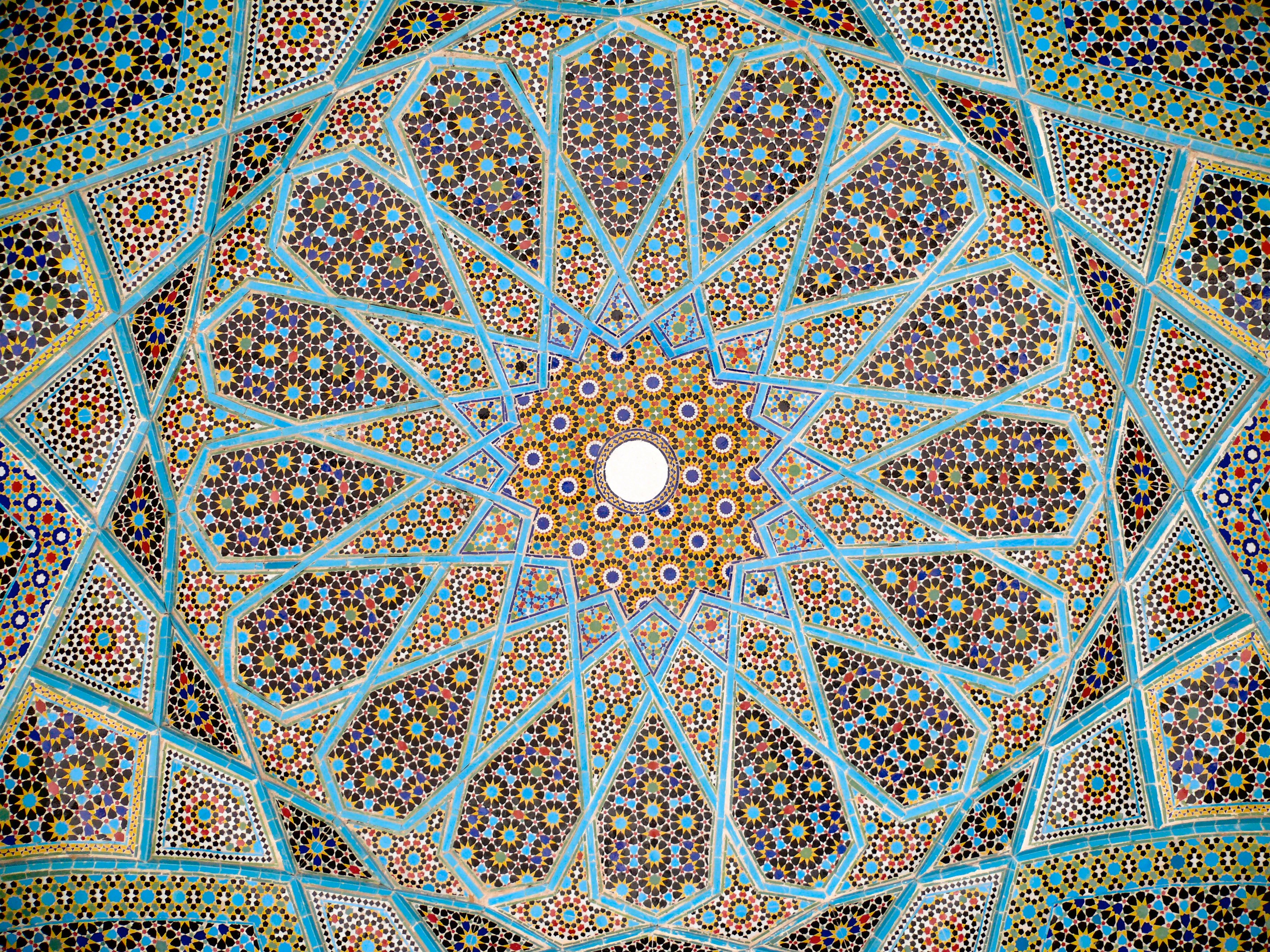
Islamic geometric patterns derived from simpler designs used in earlier cultures: Greek, Roman, and Sasanian. They are one of three forms of Islamic decoration, the others being the arabesque based on curving and branching plant forms, and Islamic calligraphy; all three are frequently used together.
Many traditional patterns were based on is the division of the circle (as a symbol of unity and diversity) in nature into regular parts. From these divisions a regular grid of triangles and/or other polygons is established, on top of which the design is elaborated. Islamic designers used the full range of Archimedean tilings (comprised of simple polygons) first discovered by the Greeks, but added to and expanded upon these. The underling tiling pattern or ‘grid’ is usually hidden beneath the final design, but this hidden order gives the designs their meditative power.
Geometric design in Great Mosque of Kairouan, Tunisia 836 ce
Geometric detail Alaeddin mosque, Konya Turkey
Girih pattern: Tomb of Hafez, Shiraz, Iran
The earliest geometrical forms in Islamic art were occasional isolated geometric shapes such as 8-pointed stars and lozenges containing squares.
Persian ‘Girih’ or knot designs: From 1086 7- and 10-point girih patterns (with heptagons, 5- and 6-pointed stars, triangles and irregular hexagons) appear in the Friday Mosque at Isfahan. 10-point girih became widespread. 8 and 12 point girih designs from 1220 onwards. Soon afterwards, sweeping 9-, 11-, and 13-point girih patterns were used in the Barsian Mosque, also in Persia.
Islamic calligraphy, is the artistic practice of handwriting and calligraphy, based upon the alphabet in the lands sharing a common Islamic cultural heritage. It includes Arabic , Ottoman, and Persian calligraphy. It is known in Arabic as khatt Islami (خط اسلامي), derived from the word ‘line’, ‘design’, or ‘construction’.
The development of Islamic calligraphy is strongly tied to the Qur’an; chapters, and excerpts from the Qur’an is a common and almost universal text upon which Islamic calligraphy is based. Deep religious association with the Qur’an, as well as suspicion of figurative art as idolatrous has led calligraphy to become one of the major forms of artistic expression in Islamic cultures.
As Islamic calligraphy is highly venerated, most works follow examples set by well established calligraphers, with the exception of secular or contemporary works. In antiquity, a pupil would copy a master’s work repeatedly until their handwriting is similar.
The traditional instrument of the Islamic calligrapher is the qalam, a pen normally made of dried reed or bamboo; the ink is often in color, and chosen such that its intensity can vary greatly, so that the greater strokes of the compositions can be very dynamic in their effect. Some styles are often written using a metallic-tip pen. Islamic calligraphy is applied on a wide range of decorative mediums other than paper, such as tiles, vessels, carpets, and inscriptions. Before the advent of paper, papyrus and parchment were used for writing. The advent of paper revolutionized calligraphy. While monasteries in Europe treasured a few dozen volumes, libraries in the Muslim world regularly contained hundreds and even thousands of books.
Coins were another support for calligraphy. Beginning in 692, the Islamic caliphate reformed the coinage of the Near East by replacing visual depiction with words. This was especially true for dinars, or gold coins of high value. Generally the coins were inscribed with quotes from the Qur’an.
By the tenth century, the Persians, who had converted to Islam, began weaving inscriptions onto elaborately patterned silks. So precious were calligraphic inscribed textiles that Crusaders brought them to Europe as prized possessions. A notable example is the Suaire de Saint-Josse, used to wrap the bones of St. Josse in the Abbey of St. Josse-sur-Mer near Caen in northwestern France.
Main styles
The most common style is divided into:
1. Kufic: oldest angular style
2. Naskh (نسخ nasḫ): cursive style . With variants Thuluth (ثلث ṯuluṯ) Ruq‘ah (رقعة ruqʿah) With the spread of Islam, the Arabic script was established in a vast geographic area with many regions developing their own unique style. From the 14th century onward, other cursive styles began to developed in Turkey, Persia, and China.
3. Nasta‘liq (نستعلیق nastaʿlīq) developed in Persia
4. Diwani (ديواني dīwānī) developed in Ottoman Empire
5) Sini is a style developed in China. The shape is greatly influenced by Chinese calligraphy, using a horsehair brush instead of the standard reed pen. A famous modern calligrapher in this tradition is HajjiNoor Deen Mi Guangjiang.
Kufic – Iraq
Kufic is the oldest form of the Arabic script developed around the end of the 7th century in the areas of Kufa, Iraq, from which it takes its name. It was the main script used to copy Qur’ans from the 8th to 10th century and went out of general use in the 12th century when the flowing naskh style become more practical, although it continued to be used as a decorative element to contrast superseding styles.
The Archaic Kufi consisted of about 17 letters without diacritic dots or accents. Afterwards, dots and accents were added to help readers with pronunciation, and the set of Arabic letters rose to 29.
There were no set rules of using the Kufic script; the only common feature is the rigid, angular, linear strokes and shapes of the characters – a modified form of the old Nabataean script. Through use in different regions, countries and calligraphers, the style later developed into several varieties, including floral, foliated, plaited or interlaced, bordered, and squared kufi.Common varieties include square Kufic, a technique known as banna’i. Contemporary calligraphy using this style is also popular in modern decorations. Decorative kufic inscriptions are often imitated into pseudo-kufics in Middle age and Renaissance Europe. Pseudo-kufics is especially common in Renaissance depictions of people from the Holy Land. The exact reason for the incorporation of pseudo-Kufic is unclear. It seems that Westerners mistakenly associated 13–14th century Middle-Eastern scripts as being identical with the scripts current at the time of Christ, and thus found natural to represent early Christians in association with them.
Naskh
The use of cursive script co-existed with kufic, but because in the early stages of their development they lacked discipline and elegance, cursive were usually used for informal purposes. With the rise of Islam, new script was needed to fit the pace of conversions, and a well defined cursive called naskh first appeared in the 10th century. The script is the most ubiquitous among other styles, used in Qur’ans, official decrees, and private correspondence. It became the basis of modern Arabic print.
Standardization of the style was pioneered by Ibn Muqla (886-940 A.D.) and later expanded by Abu Hayan at-Tawhidi (died 1009 A.D.) andMuhammad Ibn Abd ar-Rahman (1492–1545 A.D.). Ibn Muqla is highly regarded in Muslim sources on calligraphy as the inventor of the naskh style, although this seems to be erroneous. However, Ibn Muqla did establish systematic rules and proportions for shaping the letters, which use ‘alif as the x-height. Variation of the naskh includes:
Thuluth is developed as a display script to decorate particular scriptural objects. Letters have long vertical lines with broad spacing. The name reference to the x-height, which is one third of the ‘alif.
Riq’ah is a handwriting style derived from naskh and thuluth, first appeared in the 9th century. The shape is simple with short strokes and little flourishes.
Muhaqqaq is a majestic style used by accomplished calligrapher. It was considered one of the most beautiful scripts, as well as one of the most difficult to execute. Muhaqqaq was commonly used during the Mameluke era, but the use become largely restricted to short phrases, such as the basmallah, from the 18th century onward.
A cursive style developed in the 14th century by Mir Ali Tabrizi to write the Persian language for literary and non-Qur’anic works. Nasta’liq is thought to be a later development of the naskh and the earlier ta’liq script used in Iran. The name ta’liq means ‘hanging’, and refers to the slightly steeped lines of which words run in, giving the script a hanging appearance. Letters have short vertical strokes with broad and sweeping horizontal strokes. The shapes are deep, hook-like, and have high contrast.
In the 17th century Morteza Gholi Khan Shamlou and Mohammad Shafi Heravi created a new genre called cursive Nastaʿlīq Shekasteh Nastaʿlīq. Almost a century later, Abdol-Majid Taleqani, who was a prominent artist at the time, brought this genre to its highest level. This calligraphic style is based on the same rules as Nas’taliq. However, cursive Nas’taliq has a few significant differences: it provides more flexible movements, and it is slightly more stretched and curved. Yadollah Kaboli is one of the most prominent contemporary calligraphers within this style.
A cursive style of Arabic calligraphy developed during the reign of the early OttomanTurks in the 16th and early 17th centuries. It was invented by Housam Roumi and reached its height of popularity under Süleyman I the Magnificent (1520–1566).
Spaces between letters are often narrow, and lines ascend upwards from right to left. Larger variation called djali are filled with dense decorations of dots and diacritical marks in the space between, giving it a compact appearance. Diwani is difficult to read and write due to its heavy stylization, and became ideal script for writing court documents as it insured confidentiality and prevented forgery.
The traditional colours of Japan are a collection of colours traditionally used in Japanese art, literature, textiles such as kimono, and other Japanese arts and crafts.
Standardisation of the Japanese colour wheel was conducted around 600AD and western recognition of it was as late as the mid-19th century, because Japan was largely secluded from the rest of the globe until that time.
Japanese Colour Wheel
Consisting of the primary colours: Red, Yellow and Blue, as well as the neutrals, both Black and White, the Japanese colour wheel spins with reference to the natural elements and is used as a tool to interpret the Japanese theory itself.
The earliest written history of Japan, which was a mix of fact and mythology, mentions the four oldest colour terms in the Japanese language: aka 赤 or red, kuro 黒 or black, shiro 白 or white, and ao 青 or blue. However, it has been proposed that these terms originally referred to the contrasting optical sensations of light and dark, clear and vague.
With time, these ancient colour terms evolved to have the red, black, white and blue meanings in use today (as well as acquiring other symbolic meanings, which we’ll get to later). However, traces of the original four colours persist in modern Japanese. Most proverbs and surnames that mention colour, for example, often involve these four colours. Additionally, only these four colours can be prefixed with the “pure” and “genuine” ma 真, to give us makka 真っ赤 or bright red, makkuro 真っ黒 or pitch black, masshiro 真っ白 or pure white, massao 真っ青 or deep blue.
Similarly, the original ambiguity of ao appears to have stood the test of time. A vague, overlapping, blue-green colour band, termed “grue” in anthropological lingo, may be used to describe the bluish-green (or greenish-blue?) of ao – which is notorious for causing the Western confusion between aoshingou 青信号 and “green traffic light.” Or aonegi 青ネギ and “green spring onion.”
The Japanese Cap and Rank System
The traditional colours of Japan trace their historical origins to the Twelve Level Cap and Rank System which was established in 603 by Prince Shōtoku – the pioneer of japanese unification – and based on the five Chinese elements.
In this system, rank and social hierarchy were displayed and determined by certain colors. Colors known as kinjiki (禁色, “forbidden colors“) were strictly reserved for the robes of the highest ranking government officials; for example, the color ōtan (orange) was used as the color for the robes of kuge and use by any other lower rank was prohibited.
The original Japanese system consisted of 12 levels, symbolised by 2 shades of 6 colours. Dark and light shades of, purple, blue, red, yellow, white, and black were used to show virtue and demonstrate an official position. Purple being ranked 1, while black is ranked 12.
Colors known as yurushiiro (許し色, “permissible colors”) were permitted for use by the common people.
Many of the names of these colours originate from Chinese culture, where the hierarchical colour system was historically even more complex. Due to the long history of use of this color system, some variations in color and names exist.
Other pigments
The names of traditional colours are often related to native plants and animals, especially those used to make pigments and dyes. Certain colours and dyeing techniques have been used since the Asuka period, while others had been developed as late as the Meiji period when synthetic dyes became common.
An example of this would be the Japanese color name, akaneiro茜色, which was produced by creating a dye from the root of a plant called akane grass. Another perhaps more familiar example is azukiiro小豆色, or the color of azuki beans (aka the most delicious thing ever, often the filling of daifuku mochi).
Colours were also named after animals, the most popular choice seems to be the mouse, or nezumi, which is used to express grey tones. For example budou nezumiぶどうネズミ, or grape mouse (purple grey), fuji nezumi藤ネズミ, or Fuji mouse (light purple grey), yanagi nezumi柳鼠, or willow mouse (light green grey), and cha nezumi茶鼠, or tea mouse (light brown grey).
Japanese Colour Meanings
Although there are these initial meanings attributed, there are a number of different interpretations of each colour in Japan. Semantics vary from island to island and some meanings overlap.
Japanese Primary Colours
Earth (Yellow)
Wood (Blue)
Fire (Red)
Water (Black)
Metal (White)
Earth (Yellow)
Yellow represents the element of Earth and the directional Centre, but also encompasses links with the Sun and Summertime, along with the warmth of mid-summer, and concepts like the virtue of Fidelity. It also connotes of courage.
But there are also a number of similarities between both eastern (courage) and western (cowardice) meanings. Saying that someone has a yellow beak is like calling them a rookie, and a yellow voice is associated with the high-pitched tones of shrieking children and angry women.
Wood (Blue)
Blue has strictly secular connotations. One theory is that because the Japanese never worshiped an all-powerful god dwelling in heaven above, blue never became associated with lofty, religious sentiments. As well as emblematising the element of Wood, the directional East, Spring time, and Benevolence, the colour Blue encapsulates Femininity, Purity, Passivity and Calmness.
Blue was a popular choice for:
ceramics, namely sometsuke 染付け porcelain
fine art, namely the aizuri-e 藍摺り絵 woodblock prints.
indigo dyeing industry that flourished in Shikoku during the Edo period. Kimonos are predominantly crafted in or dyed with this colour, due to the fact that Blue also reflects Japanese fashion. Young Japanese women traditionally wear blue to symbolise their innocence. Japanese business suits are often made in various shades of blue and students frequently wear blue “recruitment suits”, particularly for job interviews.
Red
Red came to be associated with authority and wealth, as attested to by red-sheathed samurai swords and ornamental combs. It also has ties to religion, as demonstrated by the red torii of Shinto shrines, whose shrine maidens are traditionally clad in red hakama 袴.
Black
Black exudes dignity and formality, and is used for the robes of Buddhist monks, as well as for montsuki 紋付, the kimono that bears the family crest.
An ancient Japanese tradition known as ‘o-haguro’, which is the practice of dying one’s teeth black, considered beautiful at one point in Japanese history.
Metal (White)
Symbolic of Metal, White is a symbol of Purity and Innocence. White is godly and sacred places are strung with shimenawa 注連縄 festooned with white shide 紙垂, or strewn with white pebbles or sand.
It additionally connotes the West, the seasonal Fall, and the virtue of Justice. Aside from the black cap, Shinto priests are adorned completely in the purity of White.
Intrinsically linked with the spirit in Japanese culture, the neutral noncolor that is White was traditionally used to represent mourning and grief.
Secondary Colours
Many other colours now have significant links with specific concepts.
Green
The word for both Blue and Green (ao – 青) was used to describe both colours and the word for Green is a much more recent linguistic emergence.
Nevertheless green is an incredibly popular and symbolic colour.
Existing in numerous shades, it is emblematic of Matcha green tea – Japan’s favourite hot beverage.
it represents Eternity, Life, Vegetation, Vitality, and a plethora of other meanings.
Purple
Royalty is linked with this colour across the globe; majestic and spiritually linked with divine rule. Purple is worn by the rich and upper-classes, to symbolise both Wealth and Prestige.
Pink
Pink holds great significance in Japanese culture: in fashion, in painting, in art, and in design, among other areas. As the dominant colour of springtime Japanese landscapes, thanks to the fields of blossoms, Pink represents Happiness, Youth, and new beginnings.
Chinese culture attaches certain values to colours, like which colours are considered auspicious (吉利) or inauspicious (不利). The Chinese word for “colour” is yánsè (顏色). In Classical Chinese, the character sè (色) more accurately meant “colour in the face”, or “emotion”. It was generally used alone and often implied sexual desire or desirability. During the Tang Dynasty, the word yánsè came to mean ‘all colour’. A Chinese idiom with the meaning “many colours” or “multi-coloured”, Wǔyánliùsè (五顏六色), can also mean ‘colours’ in general.
In Chinese mythology, the goddess, Nüwa, is said to have mended the Heavens after a disaster destroyed the original pillars that held up the skies, using five coloured-stones in these five auspicious colours to patch-up the crumbling heavens, accounting for the many colours that the skies can take-on.
Theory of the Five Elements (Wuxing 五行)
In traditional Chinese art and culture, black, red, qing (青) (a conflation of the idea of green and blue), white and yellow are viewed as standard colours. These colors correspond to the five elements (五行) of water, fire, wood, metal and earth, taught in traditional Chinese physics. Throughout the Shang, Tang, Zhou and Qin dynasties, China’s emperors used the Theory of the Five Elements to select colors. Other colors were considered by Confucius as ‘inferior’.
Yellow of a golden hue is considered the most beautiful and prestigious color.[2] The Chinese conception of yellow (黃, huáng) is inclusive of many shades considered tan or brown in English and the primary association is with the earth rather than the sun. The Chinese saying Yellow generates Yin and Yang implies that yellow is the center of everything. Associated with but ranked above brown, yellow signifies neutrality and good luck. Yellow is sometimes paired with red in place of gold.
The Yellow River is the cradle of Chinese civilisation. Yellow was the emperor’s color in Imperial China and is held as the symbolic color of the five legendary emperors of ancient China, such as the Yellow Emperor. The Yellow Dragon is the zoomorphic incarnation of the Yellow Emperor of the centre of the universe in Chinese religion and mythology. The Flag of the Qing dynasty featured golden yellow as the background. The Plain Yellow Banner and the Bordered Yellow Banner were two of the upper three banners of Later Jin and Qing dynasty.
Yellow often decorates royal palaces, altars and temples, and the color was used in the dragon robes and attire of the emperors.[2] It was a rare honour to receive the imperial yellow jacket.
Yellow also represents freedom from worldly cares and is thus esteemed in Buddhism. Monks’ garments are yellow, as are elements of Buddhist temples. Yellow is also used as a mourning color for Chinese Buddhists.
Yellow is also symbolic of heroism, as opposed to the Western association of the color with cowardice.[3]
A Peking glass vase in Imperial Yellow, a shade of yellow so named for the banner of the Qing Dynasty
Black
Black (黑, hēi), corresponding to water, is generally understood as a neutral color.
The I Ching or Book of Changes regards black as Heaven’s color. The saying “heaven and earth are black” was rooted in the observation that the northern sky was black for a long time. Ancient Chinese people believed Tiandi or the Heavenly Emperor resided in the North Star. The Taiji symbol uses black and white or red to represent the unity of yin and yang. Ancient Chinese people regarded black as the king of colours and honoured black more consistently than any other colour (??). Laozi said know the white, keep the blackand Taoists believe black is the colour of the Tao.??
Black is also used in many negative contexts in idioms and common names. “Black help” (黑幫, hēibāng) is the usual name for Chinese organized crime and the Thick Black Theory of the late Qing intellectual Li Zongwu (李宗吾, 1879–1943) is an exhortation to Machiavellianism.
In modern China, black is used in clothing, especially in professional contexts. Black has less association with mourning than white in traditional Chinese culture but formal black jackets and slacks have become associated with international professionalism.
White
White (白, bái) corresponds with metal among the Five Elements and represents gold (?) and symbolises brightness, purity, and fulfilment. Light-coloured skin is highly valued by many Chinese, especially in consideration of women as potential brides.
White is also the traditional colour of mourning, although white wedding gowns have become more popular since the Opening Up Policy.
Red (t紅, s红, hóng), vermilion (丹, dān), and crimson (赤, chì) are associated with masculine yang energy and fire, good fortune and joy. Red is the traditional color used during Chinese New Year and other celebrations, including weddings and wedding gowns. Chinese reds are traditionally inclusive of shades English might consider orange or warm brown.
A hongbao—a red envelope stuffed with money, now frequently red 100 RMB notes—is the usual gift in Chinese communities for Chinese New Year, birthdays, marriages, bribes, and other special occasions. The red color of the packet symbolizes good luck. Red is strictly forbidden at funerals as it is traditionally symbolic of happiness. The names of the dead were previously written in red, so it is generally somewhat offensive to use red ink for Chinese names in contexts other than official seals.
In the People’s Republic of China, red remains a very popular color and is affiliated with and used by the Communist Party and the government.
Old Chinese did not make a blue-green distinction, having a single “verdant” color (青, qīng) that covered both. The clear blue sky and fresh green vegetables were considered shades of a single color which could even include black as its darkest hue in some contexts. Modern Standard Mandarin does make the blue-green distinction using lǜ (t綠, s绿, “leafy”) for green and lán (t藍, s蓝, “indigo“) for blue.
Qīng was associated with health, prosperity, and harmony. It was used for the roof tiles and ornate interior of the Temple of Heaven and in other structures to represent heaven. It is also the colour of most jade as well as the greenware pottery that was developed to imitate it.
Separately, green hats are associated with infidelity and used as an idiom for a cuckold. This has caused uneasiness for Chinese Catholic bishops, who, in ecclesiastical heraldry, would normally have a green hat above their arms. Chinese bishops have compromised by using a violet hat for their coat of arms.
Intermediary colours
The five intermediary colors (五間色 wǔjiànsè) are formed as combinations of the five elemental colors. These are:[6]
綠 lǜ “green”: The intermediary colour of the east, combination of central yellow and eastern blue
碧 bì “emerald-blue”: The intermediary colour of the west, combination of eastern blue and western white
紅 hóng “light-red”: The intermediary colour of the south, combination of western white and southern red
紫 zǐ “violet”: The intermediary colour of the north, combination of southern red and northern black
硫 liú “horse-brown”: The intermediary colour of the center, combination of northern black and central yellow
Western colour theory was originally formulated in terms of three “primary” or “primitive” colours—red, yellow and blue (RYB)—because these colours were believed capable of mixing all other colours.
Goethe’s colour wheel from his 1810 Theory of Colours
18th and 19th Centuries
The RYB primary colors became the foundation of 18th-century theories of color vision,[citation needed] as the fundamental sensory qualities that are blended in the perception of all physical colors, and conversely, in the physical mixture of pigments or dyes. These theories were enhanced by 18th-century investigations of a variety of purely psychological color effects, in particular the contrast between “complementary” or opposing hues that are produced by color afterimages and in the contrasting shadows in colored light. These ideas and many personal color observations were summarized in two founding documents in color theory: the Theory of Colours (1810) by the German poet Johann Wolfgang von Goethe, and The Law of Simultaneous Color Contrast (1839) by the French industrial chemist Michel Eugène Chevreul. Charles Hayter published A New Practical Treatise on the Three Primitive Colours Assumed as a Perfect System of Rudimentary Information (London 1826), in which he described how all colors could be obtained from just three.
Page from 1826 A New Practical Treatise on the Three Primitive Colours Assumed as a Perfect System of Rudimentary Information by Charles Hayter
Subsequently, German and English scientists established in the late 19th century that color perception is best described in terms of a different set of primary colors—red, green and blue-violet (RGB)—modeled through the additive mixture of three monochromatic lights. Subsequent research anchored these primary colors in the differing responses to light by three types of color receptors or cones in the retina (trichromacy).
For much of the 19th century artistic color theory either lagged behind scientific understanding or was augmented by science books written for the lay public, in particular Modern Chromatics (1879) by the American physicist Ogden Rood, and early color atlases developed by Albert Munsell (Munsell Book of Color, 1915, see Munsell color system) and Wilhelm Ostwald (Color Atlas, 1919).
20th Century
On this basis the quantitative description of the color mixture or colorimetry developed in the early 20th century, along with a series of increasingly sophisticated models of color space and color perception, such as the opponent process theory.
Across the same period, industrial chemistry radically expanded the color range of lightfast synthetic pigments, allowing for substantially improved saturation in color mixtures of dyes, paints, and inks. It also created the dyes and chemical processes necessary for color photography. As a result, three-color printing became aesthetically and economically feasible in mass printed media, and the artists’ color theory was adapted to primary colors most effective in inks or photographic dyes: cyan, magenta, and yellow (CMY). (In printing, dark colors are supplemented by black ink, known as the CMYK system; in both printing and photography, white is provided by the color of the paper.) These CMY primary colors were reconciled with the RGB primaries, and subtractive color mixing with additive color mixing, by defining the CMY primaries as substances that absorbed only one of the retinal primary colors: cyan absorbs only red (−R+G+B), magenta only green (+R−G+B), and yellow only blue-violet (+R+G−B). It is important to add that the CMYK, or process, color printing is meant as an economical way of producing a wide range of colors for printing, but is deficient in reproducing certain colors, notably orange and slightly deficient in reproducing purples. A wider range of colors can be obtained with the addition of other colors to the printing process, such as in Pantone‘s Hexachrome printing ink system (six colors), among others.
Munsell‘s 1905 color system represents colors using three color-making attributes, value (lightness), chroma, and hue.
Major advances were made in the early 20th century by artists teaching or associated with the German Bauhaus, in particular Wassily Kandinsky, Johannes Itten, Faber Birren and Josef Albers, whose writings mix speculation with an empirical or demonstration-based study of color design principles.
Itten and Albers studied the interaction between hues and the ways in which our perception of hues and tones is altered radically by the other colours surrounding them.
Art Nouveau is an international philosophy and style of art, architecture and applied art – especially the decorative arts – that was most popular during 1890–1910. Art Nouveau is known as Jugendstil in Germany, Modern in Russia, Modernisme in Catalonia, Secession in Austria-Hungary and Stile Liberty in Italy. Art Nouveau tendencies were also absorbed into local styles. In Denmark, for example, it was one aspect of Skønvirke (“aesthetic work”), which itself more closely relates to the Arts and Crafts style. Likewise, artists adopted many of the floral and organic motifs of Art Nouveau into the Młoda Polska (“Young Poland”) style in Poland.
Origins and influences
The origins of Art Nouveau are found in the resistance of the artist William Morris to the cluttered compositions and the revival tendencies of the 19th century and his theories that helped initiate the Arts and crafts movement.
The first realisation is often considered Arthur Mackmurdo’s book-cover for Wren’s City Churches (1883), with its rhythmic floral patterns.
A key influence was Japonisme with its organic forms and references to the natural world that was popular in Europe during the 1880s and 1890s. The flat perspective and strong colors of Japanese wood block prints, especially those of Katsushika Hokusai, had a strong effect on the formulation of Art Nouveau.
Feature image above generated by AI in Adobe Illustrator
Characteristics
Art Nouveau is considered a “total” art style, embracing architecture, graphic art, interior design, and most of the decorative arts including jewelery, furniture, textiles, household silver and other utensils and lighting, as well as the fine arts. It s viewed by some as the first self-conscious attempt to create a modern style. It was a reaction to academic art of the 19th century, inspired by natural forms and structures, not only in flowers and plants, but also in curved lines.
decorative “whiplash” motifs, formed by dynamic, undulating, and flowing lines in a syncopated rhythm and asymmetrical shape
As an art style, Art Nouveau has affinities with the Pre-Raphaelites and the Symbolist styles,Unlike Symbolist painting, however, Art Nouveau has a distinctive appearance; and, unlike the artisan-oriented Arts and Crafts Movement, Art Nouveau artists readily used new materials, machined surfaces, and abstraction in the service of pure design.
The style was the first major artistic stylistic movement in which mass-produced graphics (as opposed to traditional forms of printmaking, which were not very important for the style) played a key role, often techniques of colour printing developed relatively recently.
A key influence was the Paris-based Czech artist Alphonse Mucha, who produced a lithographed poster, which appeared on 1 January 1895 in the streets of Paris as an advertisement for the play Gismonda by Victorien Sardou, featuring Sarah Bernhardt. It popularised the new artistic style and its creator to the citizens of Paris. Initially named Style Mucha, (Mucha Style), his style soon became known as Art Nouveau in France. Mucha’s work has continued to experience periodic revivals of interest for illustrators and artists. Interest in Mucha’s distinctive style experienced a strong revival during the 1960s with a general interest in Art Nouveau.
However, Art Nouveau was not limited to Mucha’s style solely but was interpreted differently by artists from around the world as the movement spread. Artists such as Gustav Klimt, Charles Rennie Mackintosh, Jan Toorop, René Lalique, Antoni Gaudí and Louis Comfort Tiffany, created Art Nouveau works in their own manner. Magazines like Jugend helped publicise the style in Germany, especially as a graphic artform, while the Vienna Secessionists influenced art and architecture throughout Austria-Hungary.
Two-dimensional Art Nouveau pieces were painted, drawn, and printed in popular forms such as advertisements, posters, labels, magazines, and the like.Japanese wood-block prints, with their curved lines, patterned surfaces, contrasting voids, and flatness of visual plane, also inspired Art Nouveau. Some line and curve patterns became graphic clichés that were later found in works of artists from many parts of the world.
A fetishistic concentration on the erotic potential of the object is implicit in much Art Nouveau – echoing fin de siècle obsessions in novels and literature when the erotic briefly came to denote the modern.
Art Nouveau produced erotic sculptural or decorative domestic objects : ink-wells, carafes, centrepieces, candelabra, lamps and figurines – that manipulated the female body to create often playful symbolic narratives. These objects demanded contact – furniture or carafes where the handles are naked women that must be grasped; vessels that metamorphose into women inviting touch; lamps that provocatively pose women in suggestive positions.
Some were mildly erotic, some were much more direct and in some instances pornographic:
Rupert Carabin’s chair of 1898 plays with the physical restraint of the body. A bound female is made to support and envelope a presumably male user. It is a vision of erotic subjugation that is powerfully disturbing.
Max Blondat’s humorous door knocker designed for a Parisian brothel, is of a nude female figure peering into the interior of the brothel while simultaneously signifying the pleasures to be obtained within.
The scale of the production and dissemination of these kinds of objects denoted a widespread ‘taste for the erotic’, not only among upper-class and aristocratic collectors of the more explicit and expensive objects, but also by the middle classes, concerned to achieve the height of modern decorative style in their homes.
The end of the century also saw the advent of mass advertising. Just as the promise of sex could fill the theatres of Paris, so sex could sell anything from cigarettes and cars to painting and poetry. The erotic content in Art Nouveau advertising ranged from the subtle to the explicit. Designers did not just aim to sell the promise of sexual fulfillment to a male audience, but also, and extremely significantly, they were selling the idea of a sophisticated, decorative and glamorous identity to women – increasingly the dominant consumers. As it was women who often held the domestic purse strings, it was they who came to be associated with shopping.
Traditional gender divides were reinforced through the symbolic use of male and female imagery. Women’s capacities were traditionally perceived as being for pleasure and instinct. Designers often used used the female body to sell products and for entertainment.
Many designers used women to sell products.:
Alphonse Mucha created images of woman that epitomised the sophisticated and decorative Art Nouveau woman. His strategy of combining women with products sold a lifestyle dream, just as lifestyle became an issue for a growing metropolitan middle class with a disposable income.
Gallen-Kallela’s poster Bil-bol for a car dealer makes the promise of sexual fulfillment explicit: in an adaptation of a traditional Finnish folk story, a naked woman is violently snatched and restrained.
Leo Putz’s woman in Moderne Galerie seems to offer sex in a playful and surprisingly modern way. The idiom of Putz’s woman is that of the Bond girl. Putz in fact produced explicit erotic material, as did a number of prominent Art Nouveau graphic artists such as Fritz Erier and Aubrey Beardsley.
Designers used the male body to promote industry and technology – Men’s capacities were perceived as being for action and intellect. The perfect male body emerged in many images of the period, most often when the subject-matter demanded a ‘serious’ approach.The Italian designer Marcello Dudovich’s poster Fisso l’idea employs the muscularity and erotic potential of the male figure to promote ink and pigments. Leopoldo Metlicovitz, Gustav Klimt and Adolf Munzer all created images that used the male body to denote virility and action. These images, although not overtly erotic, sit within and promote the Classical homoerotic ‘cult’ of the male.
Homoeroticism and androgyny
The fin de siècle not only witnessed the formation of various constructions of female sexuality, but also the crystallisation of attitudes towards male sexuality. Decadence had become increasingly associated with non-conformity, and sexuality was perceived as another area for experimentation. Photography became a particularly rich area for homoerotic depiction in the period. Works by Baron von Gloedon and Fred Holland Day concentrated on representing the nude male body, both adult and child, often in erotic poses. An important element in homoerotic depiction was androgyny. Androgyny provided a vehicle free from restrictive gender codes and often allowing disturbing messages to be conveyed. Many fin de siècle artists used the androgyne to represent the resolution of what Octave Uzanne called the ‘eternal misery of the body fretted by the soul’. The androgyne could be both man and woman, adult or child, and became the ultimate fin de siècle enigmatic erotic symbol, simultaneously denying sex and providing endless erotic possibilities. Sar Piladan, leader of the Symbolist Rose+Croix group, described the androgyne as the ‘nightmare of decadence’, ‘the sex that denies sex, the sex of eternity’.
Art Nouveau style was short-lived, collapsing finally in the years prior to the First World War. The fundamental subversiveness of eroticism, its disregard for conventional morality or social structures, was seen as a destabilising factor as functionality and technological progression came to signify the new modernity,
Sculpture
Art Nouveau did not eschew the use of machines, as the Arts and Crafts Movement did. For sculpture, the principal materials employed were glass and wrought iron, resulting in sculptural qualities even in architecture. Ceramics were also employed in creating editions of sculptures by artists such as Auguste Rodin.
Architecture and interior design
Art Nouveau in architecture and interior design eschewed the eclectic revival styles of the 19th century. Though Art Nouveau designers selected and ‘modernised’ some of the more abstract elements of Rococo style, such as flame and shell textures, they also advocated the use of very stylised organic forms as a source of inspiration, expanding the ‘natural’ repertoire to use seaweed, grasses, and insects. The softly-melding forms of 17th-century auricular style, best exemplified in Dutch silverware, was another influence.
Architects tried to harmonize with the natural environment. Hyperbolas and parabolas in windows, arches, and doors are common, and decorative mouldings ‘grow’ into plant-derived forms. Japanese-inspired art and design was championed by the businessmen Siegfried Bing and Arthur Lasenby Liberty at their stores in Paris and London, respectively.Like most design styles, The text above the Paris Metro entrance uses the qualities of the rest of the iron work in the structure.
Art Nouveau architecture made use of many technological innovations of the late 19th century, especially the use of exposed iron and large, irregularly shaped pieces of glass for architecture. By the start of World War I, however, the stylised nature of Art Nouveau design—which was expensive to produce—began to be disused in favour of more streamlined, rectilinear modernism, which was cheaper and thought to be more faithful to the plainer industrial aesthetic that became Art Deco.
Art Deco, or Deco, first appeared in France after World War I and flourished internationally in the 1920s, 1930s and 1940s. Deco emerged from the interwar rapid industrialisation, embracing technology. The style is often characterized by rich colours, bold geometric shapes and lavish ornamentation, combining traditional craft motifs with Machine Age imagery and materials. During its heyday, Art Deco represented luxury, glamour, exuberance and faith in social and technological progress. Its popularity waned after World War II.
Origins
Some historians trace Deco’s roots to the Universal Exposition of 1900.After this show a group of artists established an informal collective known as La Société des artistes décorateurs (Society of Decorator Artists) to promote French crafts. Among them were Hector Guimard, Eugène Grasset, Raoul Lachenal, Paul Bellot, Maurice Dufrêne and Emile Decoeur. These artists are said to have influenced the principles of Art Deco.
In 1905, before the onset of Cubism, Eugène Grasset wrote and published Méthode de Composition Ornementale, Éléments Rectilignes, within which he systematically explored the decorative (ornamental) aspects of geometric elements, forms, motifs and their variations, in contrast with (and as a departure from) the undulating Art Nouveau style of Hector Guimard, so popular in Paris a few years earlier. Grasset stresses the principle that various simple geometric shapes like triangles and squares are the basis of all compositional arrangements.
The first use of the term Art Deco has been attributed to architect Le Corbusier, who penned a series of articles in his journal L’Esprit nouveau under the headline “1925 Expo: Arts Déco”. He was referring to the 1925 Exposition Internationale des Arts Décoratifs et Industriels Modernes (International Exposition of Modern Decorative and Industrial Arts) organized to showcase new ideas in applied artist. But the style had been in full force in France for several years before that date.
Deco was heavily influenced by pre-modern art from around the world and observable at the Musée du Louvre, Musée de l’Homme and the Musée national des Arts d’Afrique et d’Océanie. During the 1920s, affordable travel permitted in situ exposure to other cultures. There was also popular interest in archeology due to excavations at Pompeii,Troy, the tomb of Tutankhamun, etc. Artists and designers integrated motifs from ancient Egypt, Mesopotamia, Greece, Rome, Asia, Mesoamerica and Oceania with Machine Age elements.
The term came into more general use in 1966, when a French exhibition celebrating the 1925 event was held under the title Les Années 25: Art Déco/Bauhaus/Stijl/Esprit Nouveau. Here the term was used to distinguish the new styles of French decorative crafts that had emerged since the Belle Epoque.The term Art Deco has since been applied to a wide variety of works produced during the Interwar period (L’Entre Deux Guerres), and even to those of the Bauhaus in Germany. However, Art Deco originated in France. It has been argued that the term should be applied to French works and those produced in countries directly influenced by France.
Attributes
Bevis Hillier defined Art Deco as “an assertively modern style [that] ran to symmetry rather than asymmetry, and to the rectilinear rather than the curvilinear; it responded to the demands of the machine and of new material [and] the requirements of mass production”. 1968 Art Deco of the ’20s and ’30s.
Deco emphasizes geometric forms: spheres, polygons, rectangles, trapezoids, zigzags, chevrons, and sunburst motifs. Elements are often arranged in symmetrical patterns. Modern materials such as aluminum, stainless steel, Bakelite, chrome, and plastics are frequently used. Stained glass, inlays, and lacquer are also common. Colors tend to be vivid and high contrast.
Uses
Art Deco was a globally popular style and affected many areas of design. It was used widely in consumer products such as automobiles, furniture, cookware, china, textiles, jewelry, clocks, and electronic items such as radios, telephones, and jukeboxes. It also influenced architecture, interior design, industrial design, fashion, graphic arts, and cinema.
During the 1930s, Art Deco was used extensively for public works projects, railway stations, ocean liners (including the Île de France, Queen Mary, andNormandie), movie palaces, and amusement parks.
The austerities imposed by World War II caused Art Deco to decline in popularity: it was perceived by some as gaudy and inappropriately luxurious.A resurgence of interest began during the 1960s. Deco continues to inspire designers and is often used in contemporary fashion, jewelry, and toiletries.
A style related to Art Deco is Streamline Moderne (or Streamline) which emerged during the mid-1930s. Streamline was influenced by modern aerodynamic principles developed for aviation and ballistics to reduce air friction at high velocities. Designers applied these principles to cars (eg Chrysler Airflow of 1933), trains, ships, and even objects not intended to move, such as refrigerators, gas pumps, and buildings.


.svg)
_-_China-6184.jpg)