Islamic geometric patterns derived from simpler designs used in earlier cultures: Greek, Roman, and Sasanian. They are one of three forms of Islamic decoration, the others being the arabesque based on curving and branching plant forms, and Islamic calligraphy; all three are frequently used together.
Many traditional patterns were based on is the division of the circle (as a symbol of unity and diversity) in nature into regular parts. From these divisions a regular grid of triangles and/or other polygons is established, on top of which the design is elaborated. Islamic designers used the full range of Archimedean tilings (comprised of simple polygons) first discovered by the Greeks, but added to and expanded upon these. The underling tiling pattern or ‘grid’ is usually hidden beneath the final design, but this hidden order gives the designs their meditative power.
Geometric design in Great Mosque of Kairouan, Tunisia 836 ce
Geometric detail Alaeddin mosque, Konya Turkey
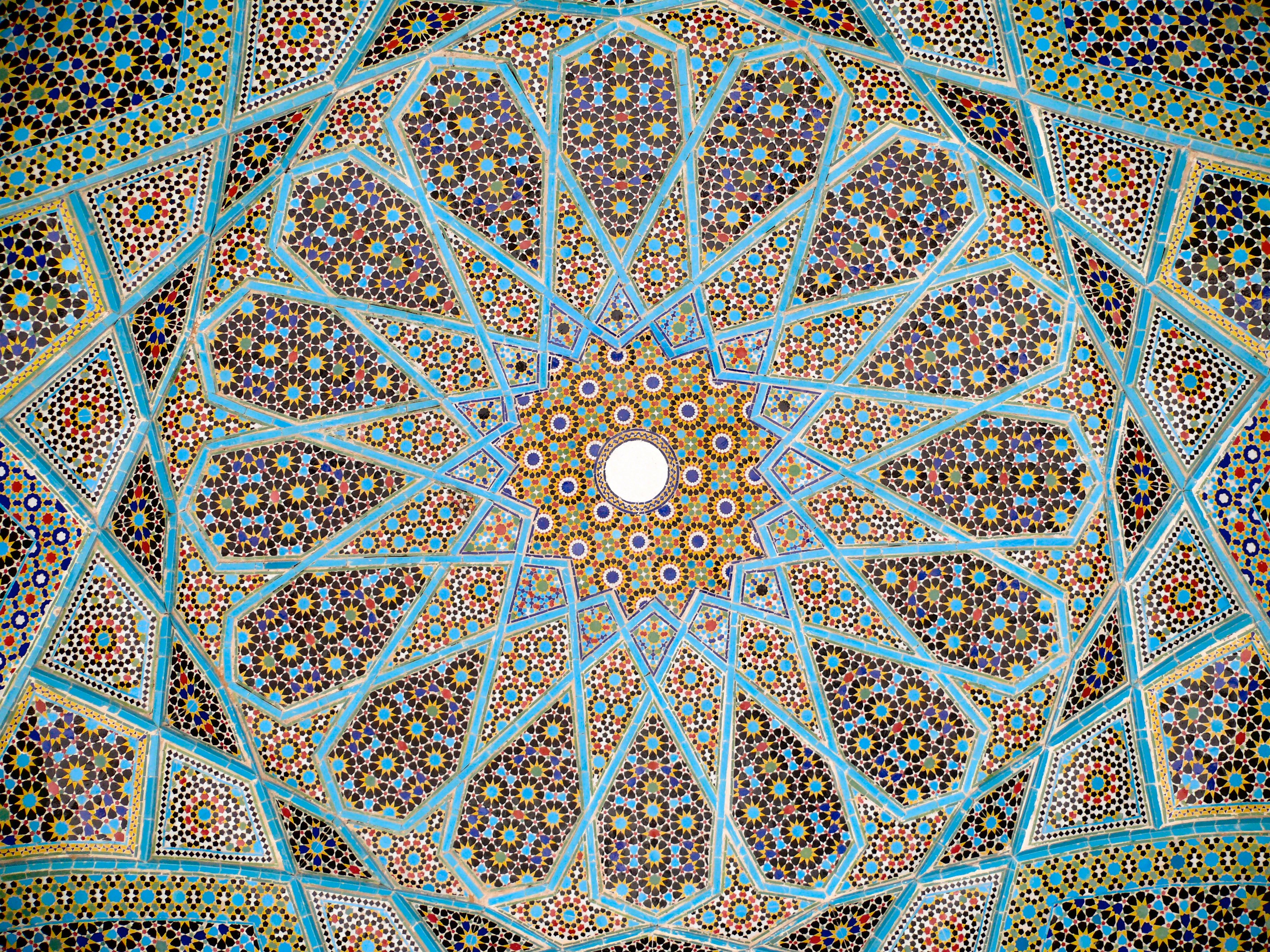
Girih pattern: Tomb of Hafez, Shiraz, Iran
The earliest geometrical forms in Islamic art were occasional isolated geometric shapes such as 8-pointed stars and lozenges containing squares.
Persian ‘Girih’ or knot designs: From 1086 7- and 10-point girih patterns (with heptagons, 5- and 6-pointed stars, triangles and irregular hexagons) appear in the Friday Mosque at Isfahan. 10-point girih became widespread. 8 and 12 point girih designs from 1220 onwards. Soon afterwards, sweeping 9-, 11-, and 13-point girih patterns were used in the Barsian Mosque, also in Persia.
Kurt Hermann Eduard Karl Julius Schwitters (1887 – 1948) was a German artist painter, sculptor, graphic designer, typographer and writer. He worked in several genres and media, including Dada, Constructivism, Surrealism, poetry, sound, and what came to be known as installation art. He is most famous for his collages, called Merz Pictures.
Studied at the School of Arts and Crafts in Hanover 1908-9 and at Dresden Academy 1909-14.
In 1918 created his own form of Dada in Hanover called ‘Merz’, using rubbish materials such as labels, bus tickets and bits of broken wood in his collages and constructions. Friendship with Arp, Hausmann and van Doesburg. Published the first edition of Anna Blume (a collection of poems and prose pieces) in 1919 and the magazine Merz 1923-32. First one-man exhibition at the Galerie Der Sturm, Berlin, 1920. Began in 1923 to build fantastic Merz constructions in his house in Hanover (the first ‘Merzbau’).
Spent the summers in Norway from 1931 and emigrated in 1937 to Lysaker near Oslo. Fled to England in 1940, spent seventeen months in internment camps, then lived 1941-5 in London. Moved in 1945 to Ambleside in the Lake District. In the last months of his life, he began a further Merz construction in an old barn at Langdale. Died at Kendal.
Martha Rosler is an American artist. She works in photography and photo text, video, installation, sculpture, and performance, as well as writing about art and culture. Rosler’s work is centered on everyday life and the public sphere, often with an eye to women’s experience. Wikipedia
Rosler’s work is quite diverse, but can be seen as underwriiten by four main themes around the question ‘What is subjectivity in the context of late capitalism?’
Biopolitical: the way that power orchestrates the body, particularly for women. Draws on de Beauvoir, Lefevre and later Foucault.
Everyday/ordinary/banale and commodification
Vernacular projects referencing Pop Art, snapshot photography and citizen journalism
Urbanism an political economy of place
Her work is directly linked to her activism: feminist, anti-power, anti-militarist and in support of human subjectivity. She draws on the theory and practice of ‘estrangement’ of Brecht and Godard where the work invites the viewer to recognise/misrecognise and then deny the content of what they are seeing – leading to critical thinking – leading to taking a position that things should be different.
She has used image and text in different ways. Some of her work is very effective in exploiting gaps and contradictions between the two ‘descriptive systems’.
This work is a large gallery frieze of a series of photographs of buildings and store fronts with bottles in various positions as traces of events, as a dyptych with ‘poems to alcohol’ – lists of words and phrases referring to drunkenness. They were produced as a counter to what Rosler sees as the voyeuristic and parasitic photography of homeless people and people with alcohol issues with quotations from them that are often taken by students, journalists or NGOs.
I find the unusual juxtaposition of two ‘ descriptive systems’ of image and text that are ‘inadequate’ in themselves to communicate collisions of power very poignant.
Semiotics of the Kitchen
Short video intended for easy showing and distribution shot in single frontal framing. Contrasts single spoken words for everyday kitchen objects with video of possible ways in which they can be used, generally with explicit or implicit violence and a dark feminist humour.
House beautiful: bringing the war home
House Beautiful: Bringing the War Back Home is an activist series of collage images that integrate comforting domestic images of American life (mostly from Life Magazine) life with images of the Vietnam war that were shown on TV each evening. She is concerned with the ways in which viewer distancing from identification with people in the photographs is achieved as a means of raising their political awareness. Some of these images are very striking in their juxtaposition and captioning eg ‘Cleaning the Drapes’. These images were photocopied and handed out to protesters on marches, and reprinted later as part of protest against other US comflicts eg Middle East.
Other works are much more direct and – I think to a modern audience used to very polished and well-constructed video on what are nowadays common themes – rather cliche. Though the same issues remain.
Experimented with ripped pages, fluoro paper and deliberate print errors to create a raw and dissonant aesthetic for a special collected edition of spy comic zero.
Guerilla Girls, a feminist group fighting sexism in arts practice. Formed in New York in 1985, the group maintain their anonymity by wearing gorilla masks and using the names of dead female artists as pseudonyms, e.g. Frida Kahlo and Hannah HÖch.
They put pressure on organisations such as the Metropolitan Museum of Art in New York by uncovering statistics that reveal the extent of patriarchy in the art world past and present. The original group disbanded in 2001 but several Guerrilla Girl spin-offs still exist.
Recent campaigns include ‘Unchain female directors’ targeted at the male-dominated world of the Hollywood film studio.
David Carson (born September 8, 1954) is an American graphic designer, art director and surfer. He is best known for his innovative magazine design, and use of experimental typography.
He worked as a sociology teacher and professional surfer in the late 1970s. From 1982 to 1987, Carson worked as a teacher in Torrey Pines High School in San Diego, California. In 1983, Carson started to experiment with graphic design and found himself immersed in the artistic and bohemian culture of Southern California. He art directed various music, skateboarding, and surfing magazines through the 1980/90s, including twSkateboarding, twSnowboarding, Surfer, Beach Culture and the music magazine Ray Gun. By the late 1980s he had developed his signature style, using “dirty” type and non-mainstream photographic techniques.
As art director of Ray Gun (1992-5) he employed much of the typographic and layout style for which he is known. In particular, his widely imitated aesthetic defined the so-called “grunge typography” era. In one issue he used Dingbat as the font for what he considered a rather dull interview with Bryan Ferry. In a feature story, NEWSWEEK magazine said he “changed the public face of graphic design”.
He takes photography and type and manipulates and twists them together and on some level confusing the message but in reality he was drawing the eyes of the viewer deeper within the composition itself. His layouts feature distortions or mixes of ‘vernacular’ typefaces and fractured imagery, rendering them almost illegible. Indeed, his maxim of the ‘end of print’ questioned the role of type in the emergent age of digital design, following on from California New Wave and coinciding with experiments at the Cranbrook Academy of Art.
In the later 1990s he added corporate clients to his list of clients, including Microsoft, Armani, Nike, Levi’s, British Airways, Quiksilver, Sony, Pepsi, Citibank, Yale University, Toyota and many others. When Graphic Design USA Magazine (NYC) listed the “most influential graphic designers of the era” David was listed as one of the all time 5 most influential designers, with Milton Glaser, Paul Rand, Saul Bass and Massimo Vignelli.
He named and designed the first issue of the adventure lifestyle magazine Blue, in 1997. David designed the first issue and the first three covers, after which his assistant Christa Smith art directed and designed the magazine until its demise. Carson’s cover design for the first issue was selected as one of the “top 40 magazine covers of all time” by the American Society of Magazine Editors.
In 2000, Carson closed his New York City studio and followed his children, Luke and Luci, to Charleston, South Carolina where their mother had relocated them. In 2004, Carson became the Creative Director of Gibbes Museum of Art in Charleston, designed the special “Exploration” edition of Surfing Magazine, and directed a television commercial for UMPQUA Bank in Seattle, Washington.
Carson claims that his work is “subjective, personal and very self indulgent”.
Bibliography
Carson, David (1995). The End of Print: The Graphic Design of David Carson. Chronicle Books. ISBN 0-8118-1199-9.
Carson, David (1997). David Carson: 2nd Sight: Grafik Design After the End of Print. Universe Publishing. ISBN 0-7893-0128-8.
Meggs, Phillip B.; David Carson (1999). Fotografiks: An Equilibrium Between Photography and Design Through Graphic Expression That Evolves from Content. Laurence King. ISBN 1-85669-171-3.
Stecyk, Craig; David Carson (2002). Surf Culture: The Art History of Surfing. Laguna Art Museum in association with Gingko Press. ISBN 1-58423-113-0.
Mcluhan, Marshall; David Carson, Eric McLuhan, Terrance Gordon (2003). The Book of Probes. Gingko Press. ISBN 1-58423-056-8.
Carson, David (2004). Trek: David Carson, Recent Werk. Gingko Press. ISBN 1-58423-046-0.
Mayne, Thom; David Carson (2005). Ortlos: Architecture of the Networks. Hatje Cantz Publishers. ISBN 3-7757-1652-1.
Pixels and vector graphics
There are two distinct ways in which your computer stores visual information digitally: you can
have either pixel images or vector graphics. If you take a magnifying glass to any computer
screen you will see that it is made up of tiny squares or dots. These are the smallest single
components of a digital image and are called pixels.
Pixels are arranged in a two-dimensional grid with each square containing a solid colour. Pixels
are good at describing colours, tones and complex visual information such as photographs.
If you scanned a conventional 35mm colour photograph into the computer it would convert
the continuous tones of the photograph into a staggered series of whole colours within the
pixel grid to give the impression of a continuous tone. Photo manipulation software generally
concerns itself with pixel-based information. Pixels are not as good at describing lines or
geometric shapes and can give typography a poor quality appearance.
Vector graphics works in a completely different way and is not generally suitable for dealing
with photographs; it tends to be used to deal with typography, logos and graphics that use
geometric shapes and lines. Vector graphics uses mathematical equations to plot a shape. This
means that these graphics can be scaled up to any size without losing quality, something that
pixel images cannot do. Vectors can be manipulated by using small points on the line that can
be moved or, in the case of a curved line, have their angles changed.
Software such as Illustrator or Freehand mainly uses vector graphics, though it is possible to
work with both pixel and vector formats in Illustrator and Photoshop.
Book Design 1 55
Resolution
Resolution refers to the amount of visual information contained in a file. Resolution is important
because you need to have good quality images if your work is to be printed.
Resolution is measured in dots per inch (dpi) or lines per inch (lpi). If you are scanning images
into your computer to use in paper-based design work then they need to be 300dpi.
If you’re downloading from a camera, keep your files as big as possible until you re-size for print.
Always keep the original version.
If you’re working on the internet then images are scanned at 72dpi. It is worth remembering
that once you get rid of resolution, for example downscaling an image from 300 to 72dpi, you
can’t then go back and replace it. This is why it’s important to save the original version.
If you’re having serious problems working with any of your software, contact your tutor. He or
she should be able to suggest a way forward. You might also find it helpful to talk to fellow
students via the OCA website. If you’re having problems, the likelihood is that someone else is
too!
Photographic creativity: colour, sharpness/focus, abstraction – NikFX and/or Lightroom and/or Camera Raw Art brushes and filters – Photoshop/Corel Painter/ iPad Masking and compositing – Photoshop
To prepare photographic positives for photoscreen and photolithography all digital images or photographs need to be converted to greyscale and printed in black ink only onto transparent film using an inkjet or laser printer. If an image contains greys it is better to darken them as they are likely to overexpose and not show up in the print.
Use CMYK? 8bit. Convert to bitmap. Output 700dpi. Method Halftone screen OK. Frequency 47 lines/inch, angle 30 degrees, Shape round.
Cyanotype negatives
Drawing/sketching and cut-out styles for design
Jesus Ramirez Photoshop Channel 1) isolate model from background eg select subject and click on add mask. refine selection.make smart object. 2) Duplicate: original, base, 3) duplicate, invert .colour dodge blend. Gaussian blur filter eg 31.8. black and white adjustment layer Charcoal filter. blend mode multiply 4) Lines layer: duplicate BW, glowing edges,invert, multiply blend. levels. blend if to hide detail. 5) Fine tune with mask 6) Add some fine pencil lines with brush tile ultimate pencil 7) Can then replace the original image in the smart object and re-edit the smart filters
Piximperfect. 1) Create the surface and base image. Mask areas you do not want. 2) Pencil sketch filter Graphic pen . use blend if to vary blackness. Split slider. Decrease opacity. Add a bit of blur .3 3) New layer pencil outline Kyle Ultimate pencil. Clip layer to sketch, so is never darker than under sketch. Can turn off pencil layer top follow the underlying photo if wsnt.
Normal colour dodge approach: BW, BW, copy, invert, blend colour dodge, filter Gaussian Blur His approach: Smart Object layer ‘Shadows’ #3 filters: Copy, Gaussian Blur, High Pass, Sketch/notepaper 0 0 25 Levels adjust Shadows layer: charcoal filter. multiply. Can add paper texture. Multiply. Can change image.
Colin Smith Photoshop cafe 1) Duplicate layer CSU black and white Colour Dodge. Gaussian Blur 2) Duplicate again invert 3) Combine to layer group and duplicate. Blur top layer even more. Blend top group to darken. Reduce opacity in top layer 4) Duplicate top layer group increase top blur a lot. Add layer mask, fill black and paint in. Largeish brush 30%. Additional details in face and hair. 5) Select everything SACE for sharpening mode. Overlay blend. High Pass.
Text portraits
Colour
Coloured pencil/pastel effects
Tony Harmer ‘The Design Ninja’ approach. Uses 1 Smart Object layer 1) Gaussian blur. dial in large value (eg 50) Divide blend mode 2) CRaw filter. Black and white. 3) Can add glowing edges. Subtract blend. 4) Oil paint filter 5) fine tune with local effects using CRaw adjustment brush on new layer 6) Can change the image through re-linking the base file.
Uses brushes and masks.
Oil/Smudge Painting
U
Watercolour
consist of:
has a very delicate effect due to the preparation of the photographic image and colour/saturation/tone adjustments on final image.
more saturated and sharper image due to preparation of photo.
darker image because of tone of paper.
Pop Art silkscreen effect
Mimics silkscreen process:
black and white simplification of photos flat/grayscale/halftone as in photoscreen
overlaying blocks of vivid flat colour. Imprecise, off-register and texturing for ink imperfections.
Uses levels for black and white. Then paint out different portions of the black and white image to separate layers. Then paint in colours.
Uses levels for black and white. Paints in greyscale on layers to separate elements. Then uses hue saturation filter to colorise. Can quickly get many alternative iterations.
Uses skart objects and halftone filter. Can easily swap the image and get the same effect.
Uses threshold filter for BW. Takes out all greys. Less control but bolder look. Gradient map. Texture overlay.
Photographic creativity: colour, sharpness/focus, abstraction – NikFX and/or Lightroom and/or Camera Raw Art brushes and filters – Photoshop/Corel Painter/ iPad Masking and compositing – Photoshop
To prepare photographic positives for photoscreen and photolithography all digital images or photographs need to be converted to greyscale and printed in black ink only onto transparent film using an inkjet or laser printer. If an image contains greys it is better to darken them as they are likely to overexpose and not show up in the print.
Image sizes:Image resolution: 300ppi.
Plate sizes: A3 37x45cms allow 6cms border so height 39cms and constrain proportions. A4: 38×25.3cms
Use CMYK? 8bit. Convert to bitmap. Output 700dpi. Method Halftone screen OK. Frequency 47 lines/inch, angle 30 degrees, Shape round.
Cyanotype negatives
Drawing/sketching and cut-out styles for design
Jesus Ramirez Photoshop Channel 1) isolate model from background eg select subject and click on add mask. refine selection.make smart object. 2) Duplicate: original, base, 3) duplicate, invert .colour dodge blend. Gaussian blur filter eg 31.8. black and white adjustment layer Charcoal filter. blend mode multiply 4) Lines layer: duplicate BW, glowing edges,invert, multiply blend. levels. blend if to hide detail. 5) Fine tune with mask 6) Add some fine pencil lines with brush tile ultimate pencil 7) Can then replace the original image in the smart object and re-edit the smart filters
Piximperfect. 1) Create the surface and base image. Mask areas you do not want. 2) Pencil sketch filter Graphic pen . use blend if to vary blackness. Split slider. Decrease opacity. Add a bit of blur .3 3) New layer pencil outline Kyle Ultimate pencil. Clip layer to sketch, so is never darker than under sketch. Can turn off pencil layer top follow the underlying photo if wsnt.
Normal colour dodge approach: BW, BW, copy, invert, blend colour dodge, filter Gaussian Blur His approach: Smart Object layer ‘Shadows’ #3 filters: Copy, Gaussian Blur, High Pass, Sketch/notepaper 0 0 25 Levels adjust Shadows layer: charcoal filter. multiply. Can add paper texture. Multiply. Can change image.
Colin Smith Photoshop cafe 1) Duplicate layer CSU black and white Colour Dodge. Gaussian Blur 2) Duplicate again invert 3) Combine to layer group and duplicate. Blur top layer even more. Blend top group to darken. Reduce opacity in top layer 4) Duplicate top layer group increase top blur a lot. Add layer mask, fill black and paint in. Largeish brush 30%. Additional details in face and hair. 5) Select everything SACE for sharpening mode. Overlay blend. High Pass.
Text portraits
Colour
Coloured pencil/pastel effects
Tony Harmer ‘The Design Ninja’ approach. Uses 1 Smart Object layer 1) Gaussian blur. dial in large value (eg 50) Divide blend mode 2) CRaw filter. Black and white. 3) Can add glowing edges. Subtract blend. 4) Oil paint filter 5) fine tune with local effects using CRaw adjustment brush on new layer 6) Can change the image through re-linking the base file.
Uses brushes and masks.
Oil/Smudge Painting
U
Watercolour
consist of:
Photo as smart object
Refinement of photo using art filters eg find edge, blur, posterise, and/or colour/tone adjustments
Overlay blend watercolour paper and/or other textures in subtle colours with or with curve adjustments to enhance texture as top layer
Mask the photo and slowly reveal using stamps with different/rotated/opacity/blended watercolour brushes.
Colour/tone/saturation adjustments on final image.
Effect can be applied to multiple images through changing photo in smart object and adjusting filter refinements as needed.
has a very delicate effect due to the preparation of the photographic image and colour/saturation/tone adjustments on final image.
more saturated and sharper image due to preparation of photo.
darker image because of tone of paper.
Pop Art silkscreen effect
Mimics silkscreen process:
black and white simplification of photos flat/grayscale/halftone as in photoscreen
overlaying blocks of vivid flat colour. Imprecise, off-register and texturing for ink imperfections.
Uses levels for black and white. Then paint out different portions of the black and white image to separate layers. Then paint in colours.
Uses levels for black and white. Paints in greyscale on layers to separate elements. Then uses hue saturation filter to colorise. Can quickly get many alternative iterations.
Uses skart objects and halftone filter. Can easily swap the image and get the same effect.
Uses threshold filter for BW. Takes out all greys. Less control but bolder look. Gradient map. Texture overlay.