

Book cover design can be:
- ‘conceptual’ or ideas-based where there is an underlying message within the design.
- ‘expressive’ employing representational or abstract imagery in a variety of media to communicate the main message/s of the book.
- be designed mainly around photographic, illustrative and typographic elements.
The cover, or dustjacket, serves two purposes:
To spell out the contents:
- So that you are in no doubt as to what you are buying? This has a tendency to mean that many titles within a particular genre look the same.
- Sex sells: Twentieth-century American pulp fiction covers often used an archetypal hour-glass figure of a woman (with smoking gun) to entice its buying audience. These covers were printed post-war, using inks that produced vibrant colours.
Branding for the publisher: to create a positive association with a particular publisher and to build a relationship with the book-buying audience.
- to protect the book:
- to express something of its contents and nature – to sell the product in a highly competitive market.
History
Early books were handbound with strong heavy covers. In the Victorian era cheap paper-covered reprints had been widely available. In 19C as books became cheaper to produce, and with developments in printing processes, using colour lithography, the book cover became more than a functional protective device: it was a space to advertise and communicate information about the book’s content. Poster designers and graphic designers of the era began to use it as such.
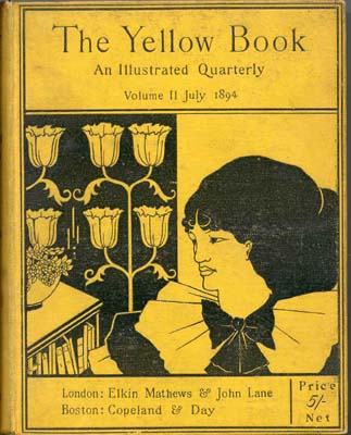
Aubrey Beardsley’s The Yellow Book (1894–97) is a good example of design to promote a book.

The Arts and Crafts movement of the early twentieth century revitalised interest in book cover design and this began to influence and infiltrate mainstream publishing.

In the 1920s radically modern cover designs were produced in the Soviet Union by Aleksandr Rodchenko and El Lissitzky.
Victor Gollantcz book covers
In the late 1920s the publisher Victor Gollancz carried out research on busy railway platforms, noticing which colours caught the eye on the book covers that appeared on newstands, as seen through the crowds. Based on his research he designed his publishing ‘house style,’ using what was at the time a very bright yellow, with inventive black and magenta typography. After black and white, yellow and black is the most easily readable colour combination.
Penguin Books:‘What is cheap need not be nasty’ Britain’s approach to cover design was somewhat more restrained. When Allen Lane approached the established publisher Bodley Head in the late 1920s, with ideas for a new, affordable approach to book design, his ideas were turned down. Lane went on to form Penguin Books and to champion a new publishing model in economically depressed Britain. Penguin’s iconic orange, black and white covers from the same era are a striking example of simple and effective design: clear, uncluttered and an early example of successful branding. In the mid 1930s Penguin formed part of the ‘paperback revolution’, producing affordable books with quality design, and their publishing identity sought to be associated with this approach. Penguin’s designs used classic yet modern typography within a clearly defined structure. The template was set up by Jan Tschichold in 1947 and broadly applied to all Penguin’s books. Penguin’s approach has become a defining mainstay of British book design and an excellent example of successful book branding.
Producing a cover
The cover has been likened to a mini-poster, and in many respects serves the same purpose, in that the design needs to grab the attention of its audience within a few seconds. Sometimes it is a new book. Publishers periodically re-vamp cover designs, to tie in with promotional features, anniversaries of the book’s original publication, film versions and other marketing opportunities.
Elements
- Concept
- Typography: the title, the author’s name, subtitle and quotes.
- Colour
- Imagery : As a general rule of thumb, to have maximum effect the cover usually bears a single image. There are, of course, exceptions to this rule; many manuals, non-fiction and ‘how to’ books use multiple images. Dorling Kindersley publications, for example, are recognisable for their crisp colour cutout photographs on a white background.
In publishing workflow, the cover is treated as a separate entity to the main book contents. The evolution of a cover design, from inception to completion, can take as long as the design of the main book itself. For example, a reasonable timespan for the design and publication of a 256-page illustrated book could be nine months. The cover or jacket design for the same book can take just as long, even though the image and textual material is significantly less. This is due in part to the many requirements that a cover has to fulfil, including commercial and marketing aspects.
The marketing and sales departments within publishing organisations know the importance of the cover with regard to revenue, so often the design of a cover involves considering a great many aspects, to meet multiple needs. This can sometimes confuse the brief. Cover design meetings can turn into ‘design by committee’, with all parties – editor, designer, sales and marketing – having their input, often with different approaches to the project. This inevitably
slows the process and can lead to conflicting messages for the designer.
Whilst it’s important to take on board everyone’s input, and adjust designs accordingly if required, ‘design by committee’ can be confusing. Essentially, the brief for a cover design needs to be clear at the outset, so that the designer has clear parameters to work within. As a designer it can occasionally be your role to argue the merits for what you consider to be a strong cover design, one that has quality and integrity within the various elements of the design.
See design workflow