
Roni Horn (born September 25, 1955) is an American visual artist and writer. Horn has been intimately involved with the singular geography, geology, climate and culture of Iceland.
Category: In Process
-
Barbara Kruger
Barbara Kruger (born January 26, 1945) is an American conceptual artist and collagist. Most of her work consists of black-and-white photographs, overlaid with declarative captions, stated in white-on-red Futura Bold Oblique or Helvetica Ultra Condensed text. The phrases in her works often include pronouns such as “you”, “your”, “I”, “we”, and “they”, addressing cultural constructions of power, identity, and sexuality. Kruger currently lives and works in New York and Los Angeles.
Most important element is the political content, making it clear and bold, though often based on enigmatic images and contradiction.
She works visually with text usually short quotes in bold typeface eg futura, and uses black, white and ‘lipstick’ red, sometimes other bold colours or limited palettes. Sometimes in caps, sometimes lower case and often reversing front and background colours.
Appropriation eg images from 1950s used in 1980s. Silkscreen.
Short introductory overview. Image and Text
Much of Kruger’s work pairs found photographs with pithy and assertive text that challenges the viewer.
Kruger has said that
“I work with pictures and words because they have the ability to determine who we are and who we aren’t.”
A larger category that threads through her work is the appropriation and alteration of existing images. In describing her use of appropriation, Kruger states:
Pictures and words seem to become the rallying points for certain assumptions. There are assumptions of truth and falsity and I guess the narratives of falsity are called fictions. I replicate certain words and watch them stray from or coincide with the notions of fact and fiction.[16]
Her method includes developing her ideas on a computer, later transferring the results (often billboard-sized) into images. Examples of her instantly recognizable slogans read “I shop therefore I am,” and “Your body is a battleground,” appearing in her trademark white letters against a red background. Much of her text calls attention to ideas such as feminism, consumerism, and individual autonomy and desire, frequently appropriating images from mainstream magazines and using her bold phrases to frame them in a new context.
Untitled (Your body is a battleground), 1989

Belief+Doubt (2012) at the Hirshhorn Museum and Sculpture Garden
Kruger discusses how she constructs her work – deciding which elements of the image interests her most, then placing text accordingly. Barbara Kruger discusses her life and work and how it has evolved from magazine cut and paste to large public murals. The questions are the important thing. Enjoys putting questins on a buge mural space. Kruger discusses a collaborative project. It is the questions that are important in having a critical view of the world. Whose values, whose hopes and whose fears? Her poster for the 1989 Women’s March on Washington in support of legal abortion included a woman’s face bisected into positive and negative photographic reproductions, accompanied by the text “Your body is a battleground.” A year later, Kruger used this slogan in a billboard commissioned by the Wexner Center for the Arts. Twelve hours later, a group opposed to abortion responded to Kruger’s work by replacing the adjacent billboard with an image depicting an eight-week-old fetus.
Kruger’s early monochrome pre-digital works, known as ‘paste ups’, reveal the influence of the artist’s experience as a magazine editorial designer during her early career. These small scale works, the largest of which is 11 x 13 inches (28 x 33 cm), are composed of altered found images, and texts either culled from the media or invented by the artist. A negative of each work was then produced and used to make enlarged versions of these initial ‘paste ups’. Between 1978 and 1979, she completed “Picture/Readings,” simple photographs of modest houses alternating with panels of words. From 1992 on, Kruger designed several magazine covers, such as Ms., Esquire, Newsweek, and The New Republic. Her signature font style of Futura Bold type is likely inspired from the “Big Idea” or “Creative Revolution” advertising style of the 1960s that she was exposed to during her experience at Mademoiselle.
In 1990, Kruger scandalized the Japanese American community of Little Tokyo, Los Angeles, with her proposal to paint the Pledge of Allegiance, bordered by provocative questions, on the side of a warehouse in the heart of the historic downtown neighborhood. Kruger had been commissioned by MOCA to paint a mural for “A Forest of Signs: Art in the Crisis of Representation,” a 1989 exhibition that also included works by Barbara Bloom, Jenny Holzer, Jeff Koons, Sherrie Levine, and Richard Prince. But before the mural went up, Kruger herself and curator Ann Goldstein presented it at various community meetings over the time period of 18 months. Only after protests did the artist offer to eliminate the pledge from her mural proposal, while still retaining a series of questions painted in the colours and format of the American flag: “Who is bought and sold? Who is beyond the law? Who is free to choose? Who follows orders? Who salutes longest? Who prays loudest? Who dies first? Who laughs last?”. A full year after the exhibition closed, Kruger’s reconfigured mural finally went up for a two-year run.
In 1994, Kruger’s L’empathie peut changer le monde (Empathy can change the world) was installed on a train station platform in Strasbourg, France. One year later, with architects Henry Smith-Miller and Laurie Hawkinson and landscape architect Nicholas Quennell, she designed the 200-foot-long (60 m) sculptural letters Picture This for a stage and outdoor amphitheater at the North Carolina Museum of Art, Raleigh. Between 1998 and 2008, she created permanent installations for the Fisher College of Business, the Broad Contemporary Art Museum at LACMA, the Moderna Museet, Stockholm, and the Price Center at the University of California, San Diego. For a site-specific piece that she produced at the Parrish Art Museum in 1998, Kruger placed across the upper range of the museum’s Romanesque facade stark red letters that read, “You belong here”; below, on columns separating three arched entry portals, stacked letters spelled “Money” and “Taste.” As part of the Venice Biennale in 2005, Kruger installed a digitally printed vinyl mural across the entire facade of the Italian pavilion, thereby dividing it into three parts—green at the left, red at the right, white in between. In English and Italian, the words “money” and “power” climbed the portico’s columns; the left wall said, “Pretend things are going as planned,” while “God is on my side; he told me so” fills the right.[23] In 2012, her installation Belief+Doubt, which covers 6,700 square feet (620 m²) of surface area and was printed onto wallpaper-like sheets in the artist’s signature colors of red, black and white, was installed at the Hirshhorn Museum and Sculpture Garden.
-
Ed Ruscha
Edward Joseph Ruscha IV (/ruːˈʃeɪ/, roo-SHAY; born December 16, 1937) is an American artist associated with the pop art movement. He has worked in the media of painting, printmaking, drawing, photography, and film. He is also noted for creating several artist’s books.
Ed Ruscha works in a very open-ended way exploiting tension between images and text that often seem rather arbitrary in their juxtaposition, making the viewer make their own connections and interpretations.
His approach is mainly aesthetic – interested in abstract potential of words against abstract design underlying his photographs and paintings. Some commentators on the You Tube videos below have seen this as rather vacuous. What concerns me is the way a focus on ‘cool’ leads to a sort of ‘apathy of the sublime’.
Rapid but pretty comprehensive visual overview of his work: photobooks, painting and text with comments by other artists. Ed Ruscha discusses his exhibition ‘Course of Empire’ at National gallery of large paintings of sections of buildings in LA at two points in time. The first 1990s in black and white and the second 2004 showing changes. References the paintings of rise and fall of civilisation by Thomas Cole on exhibition at National Gallery at the same time.
He discusses how coincidences happen in the making of a work. He does not think too much about meaning and has a compulsion to make things as an ‘involuntary reflex’ as he gets up in the morning. The words come from movies, things he hears on the radio, overheard conversations, things he reads. ‘Things just come out of the air’. Then viewers make up all sorts of meanings and connections.An extended interview where Ed Ruscha discusses how his work evolved from his early journey from Oklahoma (slow and simple) to LA (fast and furious). His first car journey he produced as the photobook 26 Gasolene Stations influenced by Robert Frank, Walker Evans and Jack Kerouac, His work on the Hollywood sign comes from the time in 1960s when he could see it from his window as a ‘weather report’ of smog levels. Not sure where ideas come from, but they do. They come. He has to preconceive ideas and puts recognisable things like words and things. Background in abstract painting, type setting and graphic design. His work is about the tension between images eg landscape, mountain tops and their symbolism ‘not making any noise’ and words that he can overlay in any size. He often uses stencils. Experiments with gunpowder. He discusses his photobooks of gasolene stations, parking lots and swimming pools. He describes them as not having any political point, aiming for a cool distance and ‘no style’. But of gasolene stations he also says ‘ what used to be Navaho land now belongs to the white man to put gasolene stations on.’ The work on parking lots and swimming pools seen from a helicopter also point to something (what? Waste? Wealth? Emptiness?) about life in LA. Discusses the ways he works across media, particularly etchings. -
Lawrence Weiner
Lawrence Charles Weiner (February 10, 1942 – December 2, 2021) was an American conceptual artist. He was one of the central figures in the formation of conceptual art in the 1960s. His work often took the form of typographic texts, a form of word art.
http://www.artnet.com/artists/lawrence-weiner/
https://www.lissongallery.com/artists/lawrence-weiner
-
Richard Littler
Littler has said “I was always scared as a kid, always frightened of what I was faced with. … You’d walk into WHSmith… and see horror books with people’s faces melting. Kids’ TV included things like Children of the Stones, a very odd series you just wouldn’t get today. I remember a public information film made by some train organisation in which a children’s sports day was held on train tracks and, one by one, they were killed. It was insane. … I’m just taking it to the next logical step.
Scarfolk is a fictional northern English town created by writer and designer Richard Littler, who is sometimes identified as the town mayor. First published as a blog of fake historical documents, parodying British public information posters of the 1970s, a collected book was published in 2014.
Scarfolk, which is forever locked in the 1970s, is a satire not only on that decade but also on contemporary events. It touches on themes of totalitarianism, suburban life, occultism and religion, school and childhood, as well as social attitudes such as racism and sexism.
Scarfolk was initially presented as a fake blog which purportedly releases artefacts from the town council’s archive. Artefacts include public information literature, out-of-print books, record and cassette sleeves, advertisements, television programme screenshots, household products, and audio and video, many of which suggest brands and imagery recognisable from the period. Additionally, artefacts are usually accompanied by short fictional vignettes which are also presented as factual and introduce residents of Scarfolk. The public information literature often ends with the strapline: “For more information please reread.”
The aesthetic is utilitarian, inspired by public sector materials in the United Kingdom such as Protect and Survive.
A television series co-written by Will Smith was described as “in the works” in 2018.
-
James Victore
Victore’s position comes across loud and direct with his statement,
‘Graphic Design is a club with big f***king spikes in, and I want to wield it.’
His interest in social and political agendas follows the same direction as Garland’s in orientating his work for more ‘useful’ objectives.
In 2005 the director David Hillman Curtis started making a series of short films recording artists, designers, illustrators, and architects talking about their ideas and process. One of these films featured the poster designer James Victore. Hillman said: I chose to film James because of his posters. I didn’t know him or much about him at the time, but I had seen a few of his pieces and had fallen in love with them. I also liked that he was doing work that was politically subversive at a time – the height of the Bush Administration’s popularity – when it seemed as if a lot of creative people were too discouraged to do so. James was very outspoken during the interview, using foul language and cussing out politicians. I kept this stuff in the film and lost Adobe as a sponsor because of it.
-

Bookbinding
Bookbinding is the process of physically assembling a book from an ordered stack of paper sheets that are folded together into sections or sometimes left as a stack of individual sheets. The stack is then bound together along one edge by either sewing with thread through the folds or by a layer of flexible adhesive. For protection, the bound stack is either wrapped in a flexible cover or attached to stiff boards. Finally, an attractive cover is adhered to the boards and a label with identifying information is attached to the covers along with additional decoration. Book artists or specialists in book decoration can greatly expand the previous explanation to include book like objects of visual art with high value and artistic merit of exceptional quality in addition to the book’s content of text and illustrations.
Bookbinding is a specialized trade that relies on basic operations of measuring, cutting, and gluing. A finished book depends on a minimum of about two dozen operations to complete but sometimes more than double that according to the specific style and materials. All operations have a specific order and each one relies on accurate completion of the previous step with little room for back tracking. An extremely durable binding can be achieved by using the best hand techniques and finest materials when compared to a common publisher’s binding that falls apart after normal use.
Bookbinding combines skills from other trades such as paper and fabric crafts, leather work, model making, and graphic arts. It requires knowledge about numerous varieties of book structures along with all the internal and external details of assembly. A working knowledge of the materials involved is required. A book craftsman needs a minimum set of hand tools but with experience will find an extensive collection of secondary hand tools and even items of heavy equipment that are valuable for greater speed, accuracy, and efficiency.
History of bookbinding
Decorative binding with figurehead of a 12th Century manuscript – Liber Landavensis.9th Century Qur’an in Reza Abbasi Museum
Sammelband of three alchemical treatises, bound in Strasbourg by Samuel Emmel ca.1568, showing metal clasps and leather covering of boards
Western books from the fifth century onwards[citation needed] were bound between hard covers, with pages made from parchment folded and sewn on to strong cords or ligaments that were attached to wooden boards and covered with leather. Since early books were exclusively handwritten on handmade materials, sizes and styles varied considerably, and there was no standard of uniformity. Early and medieval codices were bound with flat spines, and it was not until the fifteenth century that books began to have the rounded spines associated with hardcovers today.[9] Because the vellum of early books would react to humidity by swelling, causing the book to take on a characteristic wedge shape, the wooden covers of medieval books were often secured with straps or clasps. These straps, along with metal bosses on the book’s covers to keep it raised off the surface that it rests on, are collectively known as furniture.[10]The earliest surviving European bookbinding is the St Cuthbert Gospel of about 700, in red goatskin, now in the British Library, whose decoration includes raised patterns and coloured tooled designs. Very grand manuscripts for liturgical rather than library use had covers in metalwork called treasure bindings, often studded with gems and incorporating ivory relief panels or enamel elements. Very few of these have survived intact, as they have been broken up for their precious materials, but a fair number of the ivory panels have survived, as they were hard to recycle; the divided panels from the Codex Aureus of Lorsch are among the most notable. The 8th century Vienna Coronation Gospels were given a new gold relief cover in about 1500, and the Lindau Gospels (now Morgan Library, New York) have their original cover from around 800.[11]
Luxury medieval books for the library had leather covers decorated, often all over, with tooling (incised lines or patterns), blind stamps, and often small metal pieces of furniture. Medieval stamps showed animals and figures as well as the vegetal and geometric designs that would later dominate book cover decoration. Until the end of the period books were not usually stood up on shelves in the modern way. The most functional books were bound in plain white vellum over boards, and had a brief title hand-written on the spine. Techniques for fixing gold leaf under the tooling and stamps were imported from the Islamic world in the 15th century, and thereafter the gold-tooled leather binding has remained the conventional choice for high quality bindings for collectors, though cheaper bindings that only used gold for the title on the spine, or not at all, were always more common. Although the arrival of the printed book vastly increased the number of books produced in Europe, it did not in itself change the various styles of binding used, except that vellum became much less used.[12]
Up to the early nineteenth century books were hand-bound, sometimes using precious metals such as gold or silver and costly materials, including jewels, to cover valuable books and manuscripts. Book bindings had existed as a functional device for hundreds of years, both to protect the pages and also as an elaborate decorative element, to reflect the value of the contents.
The process of bookbinding began to change with the introduction of mechanical bookbinding techniques in the 1820s. The availability of cheaper materials such as cloth and paper and the faster industrialised process of mechanically-produced paper and steam-powered presses gave rise to a greater volume of books at a lower cost per book. Hand-binding began to wane as a consequence.
Historical forms of binding- Coptic binding: a method of sewing leaves/pages together
- Ethiopian binding
- Long-stitch bookbinding
- Islamic bookcover with a distinctive flap on the back cover that wraps around to the front when the book is closed.
- Wooden-board binding
- Limp vellum binding
- Calf binding (“leather-bound”)
- Paper case binding
- In-board cloth binding
- Cased cloth binding
- Bradel binding
- Traditional Chinese and Korean bookbinding and Japanese stab binding
- Girdle binding
- Anthropodermic bibliopegy (rare or fictional) bookbinding in human skin.
- Secret Belgian binding (or “criss-cross binding”), invented in 1986, was erroneously identified as a historical method.
Basic types of binding
bookbinding workshop Singapore overview http://www.bookbindingworkshopsg.com/bookbinding-techniques/
Bookbinding is an artistic craft of great antiquity, and at the same time, a highly mechanized industry. The division between craft and industry is not so wide as might at first be imagined. It is interesting to observe that the main problems faced by the mass-production bookbinder are the same as those that confronted the medieval craftsman or the modern hand binder. The first problem is still how to hold together the pages of a book; secondly is how to cover and protect the gathering of pages once they are held together; and thirdly, how to label and decorate the protective cover.[1] Few crafts can give as much satisfaction at all stages as bookbinding—from making a cloth cover for a paperback, or binding magazines and newspapers for storage, or to the ultimate achievement of a fine binding in full leather with handmade lettering and gold tooling.[2]
Before the computer age, the bookbinding trade involved two divisions. First, there was Stationery binding (known as vellum binding in the trade) which deals with making new books to be written into and intended for handwritten entries such as accounting ledgers, business journals, blank books, and guest log books, along with other general office stationery such as note books, manifold books, day books, diaries, portfolios, etc. Second was Letterpress binding which deals with making new books intended to be read from and includes fine binding, library binding, edition binding, and publisher’s bindings.[3] A result of the new bindings is a third division dealing with the repair, restoration, and conservation of old used bindings. With the digital age, personal computers have replaced the pen and paper based accounting that used to drive most of the work in the stationery binding industry.
Today, modern bookbinding is divided between hand binding by individual craftsmen working in a one-room studio shop and commercial bindings mass-produced by high speed machines in a production line factory. There is a broad grey area between the two divisions. The size and complexity of a bindery shop varies with job types, for example, from one of a kind custom jobs, to repair/restoration work, to library rebinding, to preservation binding, to small edition binding, to extra binding, and finally to large run publisher’s binding. There are cases where the printing and binding jobs are combined in one shop. A step up to the next level of mechanization is determined by economics of scale until you reach production runs of ten thousand copies or more in a factory employing a dozen or more workers.
Single leaf binding
Double fan binding
Case and bradel binding
Coptic stitch vs kettle stitch
Coptic binding
Coptic binding or Coptic sewing comprises methods of bookbinding employed by early Christians in Egypt, the Copts, and used from as early as the 2nd century AD to the 11th century.The term is also used to describe modern bindings sewn in the same style.
Coptic bindings, the first true codices, are characterized by one or more sections of parchment, papyrus, or paper sewn through their folds, and (if more than one section) attached to each other with chain stitch linkings across the spine, rather than to the thongs or cords running across the spine that characterise European bindings from the 8th century onwards. In practice, the phrase “Coptic binding” usually refers to multi-section bindings, while single-section Coptic codices are often referred to as “Nag Hammadi bindings,” after the 13 codices found in 1945 which exemplify the form.
Nag Hammadi bindings
Nag Hammadi bindings were constructed with a textblock of papyrus sheets, assembled into a single section and trimmed along the fore edge after folding to prevent the inner sheets from extending outward beyond the outer sheets. Because the inner sheets were narrower than the outer sheets after trimming, the width of text varied through the textblock, and it is likely that the papyrus was not written on until after it was bound; this, in turn, would have made it a necessity to calculate the number of sheets needed for a manuscript before it was written and bound.[3][4] Covers of Nag Hammadi bindings were limp leather, stiffened with waste sheets of papyrus. The textblocks were sewn with tackets, with leather stays along the inside fold as reinforcement. These tackets also secured the textblock to the covers; on some of the Nag Hammadi bindings, the tackets extended to the outside of the covering leather, while on others the tackets were attached to a strip of leather which served as a spine liner, and which was in turn pasted to the covers.[5] A flap, either triangular or rectangular, extended from the front cover of the book, and was wrapped around the fore edge of the book when closed. Attached to the flap was a long leather thong which was wrapped around the book two or three times, and which served as a clasp to keep the book securely shut.
Multi-section Coptic bindings
Multi-section Coptic bindings had cover boards that were initially composed of layers of papyrus, though by the 4th century, wooden boards were also frequent. Leather covering was also common by the 4th century, and all subsequent Western decorated leather bindings descend from Coptic bindings.
Approximately 120 original and complete Coptic bindings survive in the collections of museums and libraries, though the remnants of as many as 500 Coptic bindings survive.
The few surviving very early European bindings to survive use the Coptic sewing technique, notably the St Cuthbert Gospel in the British Library (c. 698) and the Cadmug Gospels at Fulda (c. 750)
Modern Coptic bindings
Modern Coptic bindings can be made with or without covering leather; if left uncovered, a Coptic binding is able to open 360°. If the leather is omitted, a Coptic binding is non-adhesive, and does not require any glue in its construction.
Artisans and crafters often use coptic binding when creating hand made art journals or other books.
Ethiopian binding
The Ethiopian bookbinding technique is a chain stitch sewing that looks similar to the multi section Coptic binding method. According to J. A. Szirmai, the chain stitch binding dates from about the sixteenth century in Ethiopia. These books typically had paired sewing stations, sewn using two needles for each pair of sewing stations (so if there are 2 holes, use 2 needles…or 6 holes, 6 needles etc.). The covers were wooden and attached by sewing through holes made into edge of the board. Most of these books were left uncovered without endbands.
Japanese Bookbinding
Islamic bookbinding
Case and Bradel binding
A Bradel binding (also called a bonnet or bristol board binding, a German Case binding, or in French as Cartonnage à la Bradel or en gist) is a style of book binding with a hollow back. It most resembles a case binding in that it has a hollow back and visible joint, but unlike a case binding, it is built up on the book. Characteristic of the binding is the material covering the outside boards is separate from the material covering the spine. Many bookbinders consider the Bradel binding to be stronger than a case binding.
This type of binding may be traced to 18th century Germany. The originator is uncertain, but the name comes from a French binder working in Germany, Alexis-Pierre Bradel (also known as Bradel l’ainé or Bradel-Derome). The binding originally appeared as a temporary binding, but the results were durable, and the binding had great success in the nineteenth century.Today, it is most likely to be encountered in photo albums and scrapbooks.
The binding has the advantage of allowing the book to open fully, where traditional leather bindings are too rigid. It is sometimes modified to provide a rounded spine. This lends the appearance of a book where the paper is not suited to spine rounding; this is also to provide a rounded spine to a book too thin for a spine rounding to hold. The binding may also provide an impressive-looking leather spine to a book without incurring the full expense of binding a book in full or partial leather.
-

Book Covers
Book cover design can be:
- ‘conceptual’ or ideas-based where there is an underlying message within the design.
- ‘expressive’ employing representational or abstract imagery in a variety of media to communicate the main message/s of the book.
- be designed mainly around photographic, illustrative and typographic elements.
The cover, or dustjacket, serves two purposes:
To spell out the contents:
- So that you are in no doubt as to what you are buying? This has a tendency to mean that many titles within a particular genre look the same.
- Sex sells: Twentieth-century American pulp fiction covers often used an archetypal hour-glass figure of a woman (with smoking gun) to entice its buying audience. These covers were printed post-war, using inks that produced vibrant colours.
Branding for the publisher: to create a positive association with a particular publisher and to build a relationship with the book-buying audience.
- to protect the book:
- to express something of its contents and nature – to sell the product in a highly competitive market.
History
Early books were handbound with strong heavy covers. In the Victorian era cheap paper-covered reprints had been widely available. In 19C as books became cheaper to produce, and with developments in printing processes, using colour lithography, the book cover became more than a functional protective device: it was a space to advertise and communicate information about the book’s content. Poster designers and graphic designers of the era began to use it as such.
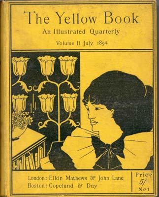
Cover of the Yellow Book by Aubrey Beardsley Aubrey Beardsley’s The Yellow Book (1894–97) is a good example of design to promote a book.

The Arts and Crafts movement of the early twentieth century revitalised interest in book cover design and this began to influence and infiltrate mainstream publishing.

El Lissitsky, book cover for the Isms of Art: 1914-1924. In the 1920s radically modern cover designs were produced in the Soviet Union by Aleksandr Rodchenko and El Lissitzky.
Victor Gollantcz book covers
In the late 1920s the publisher Victor Gollancz carried out research on busy railway platforms, noticing which colours caught the eye on the book covers that appeared on newstands, as seen through the crowds. Based on his research he designed his publishing ‘house style,’ using what was at the time a very bright yellow, with inventive black and magenta typography. After black and white, yellow and black is the most easily readable colour combination.
Penguin Books:‘What is cheap need not be nasty’ Britain’s approach to cover design was somewhat more restrained. When Allen Lane approached the established publisher Bodley Head in the late 1920s, with ideas for a new, affordable approach to book design, his ideas were turned down. Lane went on to form Penguin Books and to champion a new publishing model in economically depressed Britain. Penguin’s iconic orange, black and white covers from the same era are a striking example of simple and effective design: clear, uncluttered and an early example of successful branding. In the mid 1930s Penguin formed part of the ‘paperback revolution’, producing affordable books with quality design, and their publishing identity sought to be associated with this approach. Penguin’s designs used classic yet modern typography within a clearly defined structure. The template was set up by Jan Tschichold in 1947 and broadly applied to all Penguin’s books. Penguin’s approach has become a defining mainstay of British book design and an excellent example of successful book branding.
Producing a cover
The cover has been likened to a mini-poster, and in many respects serves the same purpose, in that the design needs to grab the attention of its audience within a few seconds. Sometimes it is a new book. Publishers periodically re-vamp cover designs, to tie in with promotional features, anniversaries of the book’s original publication, film versions and other marketing opportunities.
Elements
- Concept
- Typography: the title, the author’s name, subtitle and quotes.
- Colour
- Imagery : As a general rule of thumb, to have maximum effect the cover usually bears a single image. There are, of course, exceptions to this rule; many manuals, non-fiction and ‘how to’ books use multiple images. Dorling Kindersley publications, for example, are recognisable for their crisp colour cutout photographs on a white background.
In publishing workflow, the cover is treated as a separate entity to the main book contents. The evolution of a cover design, from inception to completion, can take as long as the design of the main book itself. For example, a reasonable timespan for the design and publication of a 256-page illustrated book could be nine months. The cover or jacket design for the same book can take just as long, even though the image and textual material is significantly less. This is due in part to the many requirements that a cover has to fulfil, including commercial and marketing aspects.
The marketing and sales departments within publishing organisations know the importance of the cover with regard to revenue, so often the design of a cover involves considering a great many aspects, to meet multiple needs. This can sometimes confuse the brief. Cover design meetings can turn into ‘design by committee’, with all parties – editor, designer, sales and marketing – having their input, often with different approaches to the project. This inevitably
slows the process and can lead to conflicting messages for the designer.Whilst it’s important to take on board everyone’s input, and adjust designs accordingly if required, ‘design by committee’ can be confusing. Essentially, the brief for a cover design needs to be clear at the outset, so that the designer has clear parameters to work within. As a designer it can occasionally be your role to argue the merits for what you consider to be a strong cover design, one that has quality and integrity within the various elements of the design.
See design workflow
-
Zentangle
Zentangle website
Anything is Possible One Stroke at a Time
At first glance, a Zentangle creation can seem intricate and complicated. But, when you learn how it is done, you realize how simple it is . . . sort of like learning the secret behind a magic trick. Then, when you create a piece of Zentangle art, you realize how fun and engrossing the process itself is.We love presenting to a class or seminar full of people who are convinced they can’t draw the Zentangle art we show them. Then, within 15 minutes, they have easily accomplished what they thought was impossible. This is one of our favorite Zentangle moments, because then we ask, “What else do you know that you can’t do?” You can transfer that insight and experience of success and accomplishment to any life experience. Something may look complicated, but you now know that you can do it, one simple stroke at a time.
Deliberate Stroke
In our Zentangle way, you draw each stroke consciously and deliberately. We are always making “strokes” (thoughts, words, deeds) in our life. By practicing the Zentangle Method’s suggestion to make each stroke deliberate, you understand how those apparently small and insignificant “strokes” of our moment to moment lives contribute to an overall life pattern. This is another reason that we say that life is an artform and everyone is an artist. Indeed, everyone draws.Deliberate Focus
As you make a deliberate pen stroke on your Zentangle tile without concerning yourself of what it will look like when you are done, that very act of putting your pen to paper focuses your attention in a special way. As your eye follows your pen strokes your attention shifts to a state that allows fresh thoughts, new perspectives, and creative insights to flow unhindered by anxiety or effort.No Eraser
There is no eraser in life and there is no eraser in a Zentangle Kit. However, in creating Zentangle art (and in living life), you will discover that apparent mistakes can be foundations for new patterns and take you in unexpected and exciting new directions.Unknown Outcomes
Unlike much art, or most activities, you start out intentionally not knowing what your Zentangle creation will look like. The Zentangle Method allows you to discover new possibilities that you might not have anticipated when you began. We can most always tell when we’ve preplanned a specific outcome when using our Zentangle Method. It almost always looks forced and stiff.No Predetermined Solution
With no predetermined correct answer, the Zentangle method offers both a freedom and a challenge. Unlike crossword, jigsaw, or Sudoku puzzles, there is no one predetermined solution. You cannot fail to create Zentangle art. At first this freedom might be a bit unnerving, as many of us have been trained to look for the one perfect solution. Soon however, this becomes a freeing and uplifting experience as you realize you can create never-ending, ever-changing “solutions” in your Zentangle creations.Elegance of Limits
In seeming contradiction the limits established by a Zentangle string frees up your creativity. As you use the Zentangle Method, you’ll understand.Abstract
You always succeed when you create Zentangle art because you always create a pattern. A Zentangle creation is meant to be nonrepresentative with no up or down. Since it is not a picture of something, you have no worries about whether you can draw a hand, or a duck. You always succeed in creating a pattern in a Zentangle way.Portable
A Zentangle tile is 3 1/2 inches (89 mm) square. A Zentangle tile is designed to be completed in one sitting. Keep some Zentangle tiles in your pocket or purse. You can finish one in as little as 15 minutes. You get an immediate sense of accomplishment by completing your work of art. Of course, you can spend as much time as you like on a tile. Time melts as you focus on and enjoy your penstrokes.Inspirational
The Zentangle Method’s non-verbal language of patterns and proportions can open doors to insights which seemed locked before. Creating in a Zentangle way opens those doors, not because they were locked, but because those doors swing on non-verbal hinges. When you create in a Zentangle way you can enter a state of relaxed focus in which intuitive insights flow freely. Get inspirations, ideas and answers unhindered by expectations or worries.High Quality
Out of respect for yourself and your craft, we always encourage people to use the best tools and materials possible. We designed our Zentangle Kit with that in mind.Ceremony
Like a Japanese Tea Ceremony, when you create Zentangle art you also create a personal environment. You can use our Zentangle approach as a tool to deliberately focus your thoughts.Gratitude
Gratitude is our foundation. It also informs our product design and our teaching method. Whether its appreciating the texture of these wonderful paper tiles, becoming aware of the patterned beauty around us or thankful for the opportunity to put pen to paper, we always return to gratitude.www.zentangle.com
Zentangle basics
https://m.youtube.com/watch?v=30ZjgmV3YOQ
Introduction to traditional approach.
No rulers, 0.1 pigment linerMore advanced variations
Alternative from art geek. Uses ruler, brushes and thicker marker
20 patterns Art Geek
24 patterns speed up art
https://m.youtube.com/watch?v=SW7-uVzhavs
Paradox
.jpg)