
Forthcoming


Design Explorations by Linda Mayoux
Experimented with ripped pages, fluoro paper and deliberate print errors to create a raw and dissonant aesthetic for a special collected edition of spy comic zero.


Book cover design can be:
The cover, or dustjacket, serves two purposes:
To spell out the contents:
Branding for the publisher: to create a positive association with a particular publisher and to build a relationship with the book-buying audience.
Early books were handbound with strong heavy covers. In the Victorian era cheap paper-covered reprints had been widely available. In 19C as books became cheaper to produce, and with developments in printing processes, using colour lithography, the book cover became more than a functional protective device: it was a space to advertise and communicate information about the book’s content. Poster designers and graphic designers of the era began to use it as such.
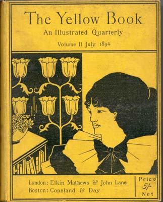
Aubrey Beardsley’s The Yellow Book (1894–97) is a good example of design to promote a book.

The Arts and Crafts movement of the early twentieth century revitalised interest in book cover design and this began to influence and infiltrate mainstream publishing.

In the 1920s radically modern cover designs were produced in the Soviet Union by Aleksandr Rodchenko and El Lissitzky.
Victor Gollantcz book covers
In the late 1920s the publisher Victor Gollancz carried out research on busy railway platforms, noticing which colours caught the eye on the book covers that appeared on newstands, as seen through the crowds. Based on his research he designed his publishing ‘house style,’ using what was at the time a very bright yellow, with inventive black and magenta typography. After black and white, yellow and black is the most easily readable colour combination.
Penguin Books:‘What is cheap need not be nasty’ Britain’s approach to cover design was somewhat more restrained. When Allen Lane approached the established publisher Bodley Head in the late 1920s, with ideas for a new, affordable approach to book design, his ideas were turned down. Lane went on to form Penguin Books and to champion a new publishing model in economically depressed Britain. Penguin’s iconic orange, black and white covers from the same era are a striking example of simple and effective design: clear, uncluttered and an early example of successful branding. In the mid 1930s Penguin formed part of the ‘paperback revolution’, producing affordable books with quality design, and their publishing identity sought to be associated with this approach. Penguin’s designs used classic yet modern typography within a clearly defined structure. The template was set up by Jan Tschichold in 1947 and broadly applied to all Penguin’s books. Penguin’s approach has become a defining mainstay of British book design and an excellent example of successful book branding.
The cover has been likened to a mini-poster, and in many respects serves the same purpose, in that the design needs to grab the attention of its audience within a few seconds. Sometimes it is a new book. Publishers periodically re-vamp cover designs, to tie in with promotional features, anniversaries of the book’s original publication, film versions and other marketing opportunities.
In publishing workflow, the cover is treated as a separate entity to the main book contents. The evolution of a cover design, from inception to completion, can take as long as the design of the main book itself. For example, a reasonable timespan for the design and publication of a 256-page illustrated book could be nine months. The cover or jacket design for the same book can take just as long, even though the image and textual material is significantly less. This is due in part to the many requirements that a cover has to fulfil, including commercial and marketing aspects.
The marketing and sales departments within publishing organisations know the importance of the cover with regard to revenue, so often the design of a cover involves considering a great many aspects, to meet multiple needs. This can sometimes confuse the brief. Cover design meetings can turn into ‘design by committee’, with all parties – editor, designer, sales and marketing – having their input, often with different approaches to the project. This inevitably
slows the process and can lead to conflicting messages for the designer.
Whilst it’s important to take on board everyone’s input, and adjust designs accordingly if required, ‘design by committee’ can be confusing. Essentially, the brief for a cover design needs to be clear at the outset, so that the designer has clear parameters to work within. As a designer it can occasionally be your role to argue the merits for what you consider to be a strong cover design, one that has quality and integrity within the various elements of the design.
See design workflow
edited from Wikipedia The Yellow Book
The Yellow Book was a British quarterly literary periodical that was published in London from 1894 to 1897. It was a leading journal of the British 1890s and lent its name to the “Yellow Nineties” and the magazine contained a wide range of literary and artistic genres, poetry, short stories, essays, book illustrations, portraits, and reproductions of paintings.
It was published by Elkin Mathews and John Lane, and later by John Lane alone, and edited by the American Henry Harland.
Aubrey Beardsley was its first art editor, and he has been credited with the idea of the yellow cover, with its association with illicit French fiction of the period. He obtained works by such artists as Charles Conder, William Rothenstein, John Singer Sargent, Walter Sickert, and Philip Wilson Steer. The literary content was no less distinguished; authors who contributed were: Max Beerbohm, Arnold Bennett, “Baron Corvo“, Ernest Dowson, George Gissing, Sir Edmund Gosse, Henry James, Richard Le Gallienne, Charlotte Mew, Arthur Symons, H. G. Wells, William Butler Yeats and Frank Swettenham. A notable feature was the inclusion of work by women writers and illustrators, among them Ella D’Arcy and Ethel Colburn Mayne (both also served as Harland’s subeditors), George Egerton, Charlotte Mew, Rosamund Marriott Watson, Ada Leverson, Netta and Nellie Syrett, and Ethel Reed.
It was to some degree associated with Aestheticism and Decadence, but also style. The first issue of The Yellow Book‘s prospectus introduces it “as a book in form, a book in substance; a book beautiful to see and convenient to handle; a book with style, a book with finish; a book that every book-lover will love at first sight; a book that will make book-lovers of many who are now indifferent to books”. The periodical was priced at 5 shillings.
Cover: The Yellow Book‘s brilliant colour immediately associated the periodical with illicit French novels – an anticipation, many thought, of the scurrilous content inside. It was issued clothbound.
Art separate from text: Harland and Beardsley rejected the idea that the function of artwork was merely explanatory: “There is to be no connection whatever [between the text and illustrations]. [They] will be quite separate”. The equilibrium which The Yellow Book poses between art and text is emphasized by the separate title pages before each individual work whether literary or pictorial.
Page layout: The Yellow Book‘s mise-en-page differed dramatically from current Victorian periodicals: “… its asymmetrically placed titles, lavish margins, abundance of white space, and relatively square page declare The Yellow Book’s specific and substantial debt to Whistler”. The use of white space is positive rather than negative, simultaneously drawing the reader’s eye to the blank page as an aesthetic and essentially created object.
Typography: The decision to print The Yellow Book in Caslon-old face further signified the ties which The Yellow Book held to the Revivalists. Caslon-old face, “an eighteenth-century revival of a seventeenth-century typographical style” became “the type-face of deliberate and principled reaction or anachronism”. A type-face generally reserved for devotional and ecclesiastical work, its use in the pages of The Yellow Book at once identified it with the “Religion of Beauty”.
Use of catch-words on every page enhanced The Yellow Book‘s link to the obsolescent. Both antiquated and obtrusive, the catch-phrase interrupts the cognitive process of reading: “making-transparent … the physical sign which constitutes the act of reading; and in doing this, catch-words participate in the ‘pictorialization’ of typography”. By interrupting readers through the very use of irrelevant text, catch-words lend the printed word a solidity of form which is otherwise ignored.