
edited from Wikipedia The Yellow Book
The Yellow Book was a British quarterly literary periodical that was published in London from 1894 to 1897. It was a leading journal of the British 1890s and lent its name to the “Yellow Nineties” and the magazine contained a wide range of literary and artistic genres, poetry, short stories, essays, book illustrations, portraits, and reproductions of paintings.
It was published by Elkin Mathews and John Lane, and later by John Lane alone, and edited by the American Henry Harland.
Aubrey Beardsley was its first art editor, and he has been credited with the idea of the yellow cover, with its association with illicit French fiction of the period. He obtained works by such artists as Charles Conder, William Rothenstein, John Singer Sargent, Walter Sickert, and Philip Wilson Steer. The literary content was no less distinguished; authors who contributed were: Max Beerbohm, Arnold Bennett, “Baron Corvo“, Ernest Dowson, George Gissing, Sir Edmund Gosse, Henry James, Richard Le Gallienne, Charlotte Mew, Arthur Symons, H. G. Wells, William Butler Yeats and Frank Swettenham. A notable feature was the inclusion of work by women writers and illustrators, among them Ella D’Arcy and Ethel Colburn Mayne (both also served as Harland’s subeditors), George Egerton, Charlotte Mew, Rosamund Marriott Watson, Ada Leverson, Netta and Nellie Syrett, and Ethel Reed.
It was to some degree associated with Aestheticism and Decadence, but also style. The first issue of The Yellow Book‘s prospectus introduces it “as a book in form, a book in substance; a book beautiful to see and convenient to handle; a book with style, a book with finish; a book that every book-lover will love at first sight; a book that will make book-lovers of many who are now indifferent to books”. The periodical was priced at 5 shillings.
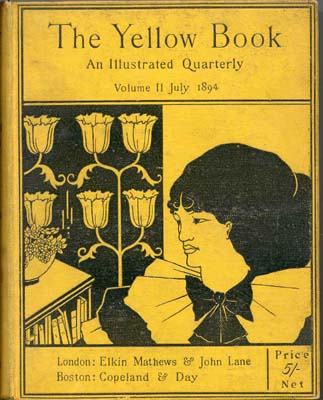
Cover: The Yellow Book‘s brilliant colour immediately associated the periodical with illicit French novels – an anticipation, many thought, of the scurrilous content inside. It was issued clothbound.
Art separate from text: Harland and Beardsley rejected the idea that the function of artwork was merely explanatory: “There is to be no connection whatever [between the text and illustrations]. [They] will be quite separate”. The equilibrium which The Yellow Book poses between art and text is emphasized by the separate title pages before each individual work whether literary or pictorial.
Page layout: The Yellow Book‘s mise-en-page differed dramatically from current Victorian periodicals: “… its asymmetrically placed titles, lavish margins, abundance of white space, and relatively square page declare The Yellow Book’s specific and substantial debt to Whistler”. The use of white space is positive rather than negative, simultaneously drawing the reader’s eye to the blank page as an aesthetic and essentially created object.
Typography: The decision to print The Yellow Book in Caslon-old face further signified the ties which The Yellow Book held to the Revivalists. Caslon-old face, “an eighteenth-century revival of a seventeenth-century typographical style” became “the type-face of deliberate and principled reaction or anachronism”. A type-face generally reserved for devotional and ecclesiastical work, its use in the pages of The Yellow Book at once identified it with the “Religion of Beauty”.
Use of catch-words on every page enhanced The Yellow Book‘s link to the obsolescent. Both antiquated and obtrusive, the catch-phrase interrupts the cognitive process of reading: “making-transparent … the physical sign which constitutes the act of reading; and in doing this, catch-words participate in the ‘pictorialization’ of typography”. By interrupting readers through the very use of irrelevant text, catch-words lend the printed word a solidity of form which is otherwise ignored.