Art Deco, or Deco, first appeared in France after World War I and flourished internationally in the 1920s, 1930s and 1940s. The style is often characterized by rich colours, bold geometric shapes and lavish ornamentation. Its popularity waned after World War II.
Art Nouveau is an international philosophy and style of art, architecture and applied art – especially the decorative arts – that was most popular during 1890–1910. Art Nouveau is known as Jugendstil in Germany, Modern in Russia, Modernisme in Catalonia, Secession in Austria-Hungary and Stile Liberty in Italy.
The Bauhaus was founded in 1919 in the city of Weimar by German architect Walter Gropius (1883–1969). Its core objective was a radical concept: to reimagine the material world to reflect the unity of all the arts. Other visual artists included Paul Klee, Vasily Kandinsky and Josef Albers.
Constructivism was primarily an art and architectural movement originating in Russia after World War 1. It rejected the idea of art for arts’ sake and the traditional bourgeois class of society to which previous art had been catered. Instead it favoured art as a practise directed towards social change or that would serve a social…
Dada or Dadaism was an art movement of the European avant-garde in the early 20th century. The movement primarily involved visual arts, literature, poetry, art manifestos, art theory, theatre, and graphic design, and concentrated its anti-war politics through a rejection of the prevailing standards in art through anti-art cultural works.
Futurism (Italian: Futurismo) was an artistic and social movement that originated in Italy in the early 20th century. It emphasized speed, technology, youth, and violence, and objects such as the car, the aeroplane, and the industrial city. It glorified modernity and aimed to liberate Italy from the weight of its past.
The International Typographic Style, also known as the Swiss Style, is a graphic design style that emerged in Russia, the Netherlands and Germany in the 1920s and developed by designers in Switzerland during the 1950s. The International Typographic Style has had profound influence on graphic design as a part of the modernist movement, impacting many…
Modernism in design and architecture emerged in the aftermath of the First World War and the Russian Revolution – a period when the artistic avant-garde dreamed of a new world free of conflict, greed and social inequality. It was not a style but a loose collection of ideas.
What were the social and political conditions that made these artists communicate in the ways they did?
How is this demonstrated in their work?
How did these artists establish their own artistic identity?
“I have had to go to men as sources in my painting because the past has left us so small an inheritance of woman’s painting that had widened life….Before I put a brush to canvas I question, “Is this mine? Is it all intrinsically of myself? Is it influenced by some idea or some photograph of an idea which I have acquired from some man?”
Some people have found it helpful to think about the history of the feminist movement in terms of first, second and third waves. Broadly speaking, these are:
First wave – from the formation of the National Women’s Society for Women’s Suffrage in 1867 to full female enfranchisement in the UK in 1928.
Second wave – from the feminist movements associated with the American civil rights movement of the early 1960s to equality legislation in the UK in the 1970s.
Third wave – from the 1980s to the present day, more about social and political change than legislative change.
Sketchdesk 2024: The undeniable impact of women in design
These 15 female graphic designers didn’t just break barriers. They reshaped the landscape of graphic design with their lifelong commitments to creativity, innovation, and vision. Ivy Croteau March 7, 2024
Paula Scher
Paula Scher is a trailblazer in the world of graphic design, known for her bold and eclectic style. As a partner at Pentagram, she worked on iconic projects like the rebranding of Citibank and Microsoft Windows. As a designer, Scher’s innovative approach to typography and branding earned her numerous accolades, solidifying her place as one of the most influential female graphic designers of our time.
Carolyn Davidson
Carolyn Davidson is best known for her creation of the iconic Nike “Swoosh” logo. Her minimalist yet impactful design became synonymous with the global sportswear brand, showcasing her innate ability to capture the essence of a company through visual identity.
Jane Davis Doggett
Jane Davis Doggett made history as the first woman to design signage for a major airport – the iconic Miami International Airport. Her innovative use of color and typography transformed airport way-finding systems, setting a new standard for environmental graphic design.
Jessica Walsh
Jessica Walsh is a design powerhouse, known for her vibrant and experimental approach to graphic design. Co-founder of the creative agency Sagmeister & Walsh, she worked with major brands such as Levi’s and The New York Times. As a designer, Walsh’s bold and imaginative designs continue to push the boundaries of visual communication.
Susan Kare
Susan Kare is a pioneer in the field of digital iconography. In the height of her career, she designed many of the original icons for the Apple Macintosh computer. Her pixel art designs, including the iconic “Happy Mac” and “Command Key,” are ingrained in pop culture, cementing her influence on user interface design.
Jessica Hische
Jessica Hische is a lettering artist and typographer renowned for her intricate and elegant designs. Her work spans branding, book covers, and editorial design, with clients including Wes Anderson and Penguin Books. As a designer, Hische’s dedication to craftsmanship and attention to detail earned her widespread acclaim in the design community.
Leta Sobierajski
Leta Sobierajski is a multidisciplinary designer known for her bold and unconventional approach to visual communication. Her playful use of color and texture challenges traditional design conventions, resulting in dynamic and engaging work across print and digital platforms.
Louise Fili
Louise Fili is a master of typographic design, celebrated for her exquisite craftsmanship and vintage-inspired aesthetics. With a career spanning over four decades, she created iconic branding and packaging designs for clients like Tiffany & Co. and the New York Public Library.
Marian Bantjes
Marian Bantjes is celebrated for her intricate and ornamental typographic designs that blur the line between illustration and lettering. Characterized by its meticulous attention to detail and whimsical aesthetic, her work garners admiration from designers worldwide.
Bea Feitler
Bea Feitler was a pioneering art director and graphic designer whose work revolutionized the world of editorial design. As art director for publications such as Harper’s Bazaar and Rolling Stone, she brought a bold and innovative approach to magazine layout and design, shaping the visual landscape of the 1960s and 70s.
April Greiman
April Greiman is a visionary designer known for her groundbreaking work in digital design and new media. A pioneer of the “New Wave” design movement, she embraced technology to create dynamic and interactive design experiences. Greiman’s innovative approach continues to inspire designers to push the boundaries of traditional graphic design.
Deborah Sussman
Deborah Sussman was a prolific designer whose colorful and exuberant designs helped define the visual identity of the 1984 Los Angeles Olympics. Her bold use of color and geometric forms brought a sense of joy and vibrancy to the Olympic experience, leaving a lasting legacy in the world of environmental graphic design.
Cipe Pineles
Cipe Pineles was a groundbreaking female art director and designer, breaking barriers in the male-dominated world of editorial design. As the first female art director at Conde Nast, she played a pivotal role in shaping the visual identity of publications such as Vogue and Glamour, paving the way for future generations of female art directors.
Zuzana Licko
Zuzana Licko is a pioneering type designer and co-founder of the digital type foundry Emigre. Her experimental approach to typography challenged traditional design norms, leading to the creation of groundbreaking typefaces that revolutionized the industry. Licko’s innovative designs continue to influence contemporary typography and graphic design.
Saudi Arabian art includes both the arts of Bedouin nomads and those of the sedentary peoples of regions such as the Hejaz, Tihamah, Asir and the Najd. There is also a vibrant modern art scene in major cities highlighting social issues, with a number of prominent women artists.
Architecture
Interior Mosque al Nabawi
The first mosque of Islam was the house of the Islamic prophet Mohammed in Medina. It is the prototype of all later sacred architecture of Islam. In it are most important the floor and carpet that are touched in prayer with the head.
Bedouin art
Saudi Rock art
Tribal symbols referred to as “wusum” were carved by Bedouins during prehistoric times and are found as rock art in the hills and deserts of Arabia.
Modern Art Movement
The Art Movement in Saudi Arabia started in the mid 60’s by a group of School Art Teachers and lasted till mid 80’s. Prince Khalid Al Faisal, himself a poet and artist, inaugurated a cultural centre in Asir Province to promote young fresh talent. It was from this project that one of Saudi Arabia’s most prominent contemporary artists, Ahmed Mater, emerged. In 1972 Mohammed Said Farsi became the mayor of the coastal city of Jeddah, making the city one of the largest open-air art galleries in the world. Artists incorporated media outlets such as photography and video technology.
Recently, there has been an increase in public galleries exhibiting modern art in Saudi Arabia. This supported by the influx of commercial galleries and a growing grass-roots movement of artists who have acquired international status.
Motifs from perfume bottles found at Tel AbrakEl Hafit tombs
Modern Art
MyneandyoursNational Day lips: Sisters Beauty Lounge is located in five prestigious locations throughout the country: Al Bateen Abu Dhabi, The Village Mall in Jumeirah, The Dubai Mall, Mirdif City Centre, and the Mall of the Emirates.
There is a lot of disagreement about ‘colour in Islam’. Some colours appear to be recommended or forbidden. But this often differs between Quran and Hadith and different Islamic sects. There is very rich use of colour in arts and crafts in Islamic cultural traditions and modern visual creativity.
Pan-Arab colours
White, black, green and red, dominate the flags of Arab states.
Green
Green (Arabic: أخضر) is considered the traditional colour of Islam.
The Arabic word for “greenness” is mentioned several times in the Quran, describing the state of the inhabitants of paradise. Reclining on green Cushions and rich Carpets of beauty — Sura 55, verse 76.Upon them will be green garments of fine silk and heavy brocade, and they will be adorned with bracelets of silver; and their Lord will give to them to drink of a Water Pure and Holy. — Sura 76, verse 21.Al-Khidr (“The Green One”) is a Qur’anic figure who met and traveled with Moses.
The Green Dome, traditional site of the tomb of Muhammad, was painted green on the order of sultan Abdul Hamid II (r. 1876–1909).
Green was used as the colour of the banners of the historical Fatimid Caliphate. The Umayyads fought under green and gold banners. Green is also used in several national flags as a symbol of Islam. These include: Afghanistan, Algeria, Azerbaijan, Comoros, Iran, Mauritania, Pakistan, Saudi Arabia. and Sri Lanka.
Black
The Abbasids chose black (blue) and fought under black banners.
It is often worn by Shi’ite Muslims, who mourn the death of Husayn ibn Ali, killed at the Battle of Karbala. Black cloaks are worn by the ayatollahs, the Shi’a clergy. In many Shi’a countries, a black turban is worn only by male sayids, men who descend from Muhammad through his daughter Fatimah and his son-in-law Ali.
Symbol of modesty in some Muslim cultures. It is the colour of the chador worn by devout Iranian Shi’ite women
Black is considered the colour of mourning in Western and Mediterranean countries. But this is seen as a Christian tradition.
White
The colour white symbolizes purity and peace.
Many Muslims wear the colour white when they attend Friday prayers and when performing sacred rites of pilgrimage.
In Sunni tradition, Muhammad wore a white kufi (head cap) with a black amaana (turban).
The Umayyads chose white for their battle standards when they fought the Abbassid during the Caliphate period
It has appeared on many Islamic flags since.
Red
Has no religious significance.
Some claim the hadith forbids the wearing of pure red clothing, it should be mixed with patches of other colours
Various countries on the Persian Gulf have chosen red flags
Blue and turquoise
many Islamic towns in the middle east, tend to have blue color? for example, the also many houses in sana city of yemen also painted the windows and the doors in blue color? even the villages in santorini Island of greece also painted in blue and white?………..the nazar bonjuk of turkey also in the blue color. Do you think is it possible that they painted the houses in blue, blue green, white and light yellow is because those soft colors are counteract the high color of the heat desert?
Turquoise
The colour turquoise greenish blue, has a special cultural place in Islam, though apparently not clear religious significance.
decoration of mosques and other buildings in Middle East: blue town of Chefchaouen in Morocco, blue town of Sidi bu Said in Tunisia, blue mosque and blue rooms in Topkapi palace of Turkey, blue in mosques of Isfahan and Shiraz in Iran
used in coats of arms, so that they could not possibly be mistaken for their Muslim opponents in the heat of battle.
Yellow
The yellow colour of gold symbolizes wisdom.
Brown
Brown is often believed to symbolize purity and peace.
Women are at the centre of the contemporary Saudi art scene, posing questions on the current political climate and women’s rights.
Alaan Artspace
Riyadh’s first curated contemporary art platform. The name Alaan, meaning ‘now’ in Arabic, is supposed to represent the energy and power of the prevailing art scene in Saudi Arabia. The exhibition shows works entirely created by women, who are both diverse methodologically and in terms of their artistic style. Further, the founder, creative director and chief curator are all women. The gallery also hosts master classes and workshops, organized by Sara Raza (the former curator of public programmes for London’s Tate Modern Museum), teaching prospective artists about contemporary art. Moreover, Alaan Artspace funds its non-commercial exhibitions, commissions new works and offers free non-profit educational arts programming through revenues from its shop, restaurant and café.
Manal Al Dowayan (1973) was born in Dhahran, the Eastern province of Saudi Arabia. Initially she studied Systems Analysis (MSc) and worked as a Creative Director in an oil company. She was working and producing art for 7 years until she became a full time artist in 2010. This was a result of an active art industry that was evolving in her region. Dowayan has rapidly become one of the leading advocates of contemporary artists in the Middle East. She studied abroad in a number of art institutions including USA, London, Dubai and Bahrain. She works mostly with photographs and installations and her work is largely feminist in nature. Her most revered piece is ‘Suspended Together’, a flock of doves made from fiber-glass with stickers on their bodies . The doves are interlocked and made up of permission slips that women in Saudi Arabia must have signed by their husbands or male guardians to have permission to travel.
An internationally acclaimed artist, she has exhibited her work at the Venice Biennial Collateral show “The Future of a Promise” in 2011 and at the Victoria and Albert Museum as part of exhibition that showcases their public acquisitions of Middle East Photography titled “Light From the Middle East” in 2013 and the American Biennial Prospect New Orleans in an exhibition titled “Notes For Now” in 2014 where she showed a collection of 20 photographs and 11 videos titled “If I Forget You Don’t Forget Me” she also participated in Fluid Form: Contemporary Art from Arab Countries (2010) in Seoul at Freedom to Create (2011) in New York and at Simply Words in Switzerland (2012)
Samiah Khashoggi, born 1958 in Abha, is an interior designer, painter, and organizer of Saudiaat, an art exhibition. In 1982, she graduated from Kingston University in the UK with a bachelor’s degree in interior design, and in 2005 completed her Masters of Fine Arts from De Montfort University. She is an assistant professor of interior design at Dar Al Hekma College. For a few years starting in 1983, she worked as the first female designer at her brother’s furniture and design company.
Working on her MFA required her to interview and organize an exhibit for local female artists. Her exhibition for her MFA turned into a regular exhibition called Saudiaat, featuring contemporary female Saudi Arabian artists. As well as featuring artwork, Saudiaat also supports local female artists and educates the public about the techniques involved in their work. As of 2012, the group has had four exhibitions, with the 2012 exhibition, titled “Directions”, having been held in Jeddah.
Nabatt: A Sense of Being (2010) is an exhibition of contemporary art from Saudi Arabia. It is presented by the Saudi Arabian Pavilion at the Shanghai World Expo. Amongst the artists exhibiting, it features works by Shadia & Raja Alem, Reem Al Faisal, Lulwah Al Homoud, Jowhara Al Saud, Noha Al-Sharif] & Maha Mullah. The show attempts at engaging with the diverse nature of life, notably human relationships and the interactions amongst and within social groups and communities.
Edge of Arabia
Edge of Arabia (2003) is a UK independent non-profit organisation, founded by an artist collective.
We Need to Talk: Jeddah
In January 2012, it organised a 40-piece exhibition entitled ‘We Need to Talk’. More than a third of the works displayed were by women.
Come Together: London
In October 2012, it presented ‘Come Together’ curated by Stephen Stapleton displaying large-scale, multi-media work by leading Arab artists. The name of the exhibition, Come Together was a reference to social networking channels and their influence on individual expression in the Arab World. The show featured the work of 30 emerging artists which included works by Saudi Arabia’s Sarah Al Abdali and Manal Al Dowayan. In addition to the exhibition Edge of Arabia teamed up with The Crossway Foundation, Dar Al Mamûn and Future Shorts to incorporate an education programme comprising workshops, film screenings, topical discussions, and guided exhibition tours.
Soft Power
Soft Power (September 26 – December 10, 2012) was the inaugural show at Alaan Artspace. Soft Power represents an innovative project, looking at the complex domain of a woman’s role and the position of women within contemporary Saudi society. It features three Saudi female artists: Sarah Abu Abdallah, Sarah Mohanna Al-Abdali and Manal Al Dowayan. The exhibition, rather than being explicitly political, explores the subtleties of the political and social contentions prevalent in Saudi Arabia. Throughout the exhibition, there are references made to the guardianship laws adopted in Saudi Arabia. The female subjects represented are givers, consumers, objects, power-brokers and caretakers. As stated by the exhibitions website, the artists embrace ‘a nuanced and at times humorous approach towards exploring the position of women within contemporary society.’ The name of the exhibition encapsulates this stance, and the subjects of the works themselves, which attempt at reshaping the expected narrative. Moreover, it offers a platform for discussion and dialogue on matters concerning art in Saudi Arabia.
Wadjda
Wadjda, is the first feature film to be made in Saudi Arabia it was directed by a woman. Haifaa Al Mansour, made her debut at the Venice film festival. Her feature film explores the restrictions placed on women in the conservative Islamic kingdom. It took her three years to have the permission and backing to make. It is a Saudi/German co-production, produced by the Berlin-based Razor Film Produktions with support from Rotana Studios. It is the first film entirely shot in Saudi Arabia, documenting the everyday trials and tribulations of a young Saudi Arabian girl, Wadja. It encapsulates her childhood journey opposing social norms and restrictions both at home and school. Al Mansour hoped the film would help to change attitudes towards women and film both within and outside Saudi Arabia. However, the film is yet to be seen in Saudi Arabia until its subsequent television release. Al Mansour claims to have faced a number of challenges casting and filming in a country steeped in conservative attitudes. She aimed to depict the segregation of women in Saudi Arabia. Namely, the fact that women have lower legal status than men, are subject to guardianship laws and are banned from driving.
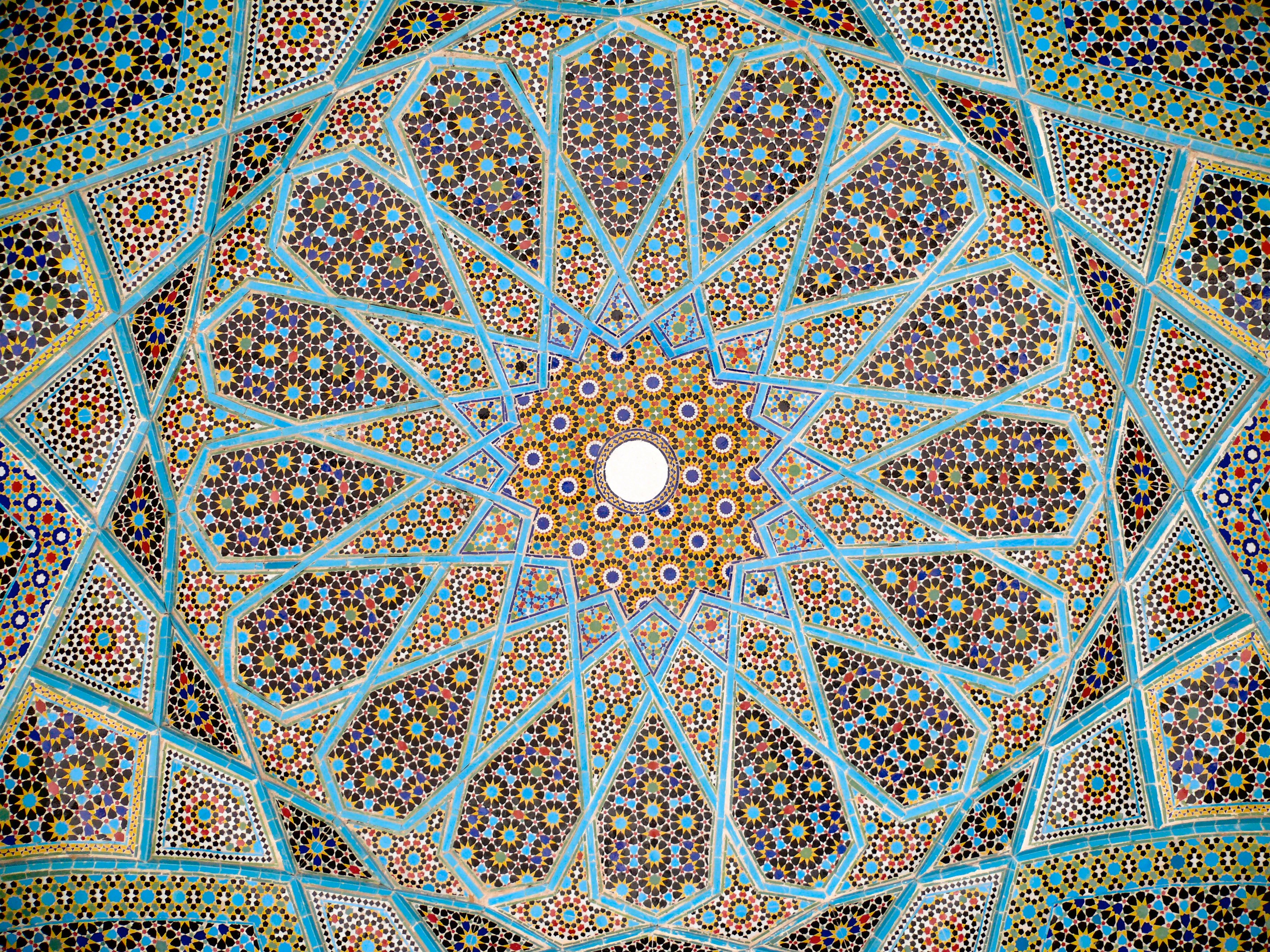
Islamic geometric patterns derived from simpler designs used in earlier cultures: Greek, Roman, and Sasanian. They are one of three forms of Islamic decoration, the others being the arabesque based on curving and branching plant forms, and Islamic calligraphy; all three are frequently used together.
Many traditional patterns were based on is the division of the circle (as a symbol of unity and diversity) in nature into regular parts. From these divisions a regular grid of triangles and/or other polygons is established, on top of which the design is elaborated. Islamic designers used the full range of Archimedean tilings (comprised of simple polygons) first discovered by the Greeks, but added to and expanded upon these. The underling tiling pattern or ‘grid’ is usually hidden beneath the final design, but this hidden order gives the designs their meditative power.
Geometric design in Great Mosque of Kairouan, Tunisia 836 ce
Geometric detail Alaeddin mosque, Konya Turkey
Girih pattern: Tomb of Hafez, Shiraz, Iran
The earliest geometrical forms in Islamic art were occasional isolated geometric shapes such as 8-pointed stars and lozenges containing squares.
Persian ‘Girih’ or knot designs: From 1086 7- and 10-point girih patterns (with heptagons, 5- and 6-pointed stars, triangles and irregular hexagons) appear in the Friday Mosque at Isfahan. 10-point girih became widespread. 8 and 12 point girih designs from 1220 onwards. Soon afterwards, sweeping 9-, 11-, and 13-point girih patterns were used in the Barsian Mosque, also in Persia.
Islamic calligraphy, is the artistic practice of handwriting and calligraphy, based upon the alphabet in the lands sharing a common Islamic cultural heritage. It includes Arabic , Ottoman, and Persian calligraphy. It is known in Arabic as khatt Islami (خط اسلامي), derived from the word ‘line’, ‘design’, or ‘construction’.
The development of Islamic calligraphy is strongly tied to the Qur’an; chapters, and excerpts from the Qur’an is a common and almost universal text upon which Islamic calligraphy is based. Deep religious association with the Qur’an, as well as suspicion of figurative art as idolatrous has led calligraphy to become one of the major forms of artistic expression in Islamic cultures.
As Islamic calligraphy is highly venerated, most works follow examples set by well established calligraphers, with the exception of secular or contemporary works. In antiquity, a pupil would copy a master’s work repeatedly until their handwriting is similar.
The traditional instrument of the Islamic calligrapher is the qalam, a pen normally made of dried reed or bamboo; the ink is often in color, and chosen such that its intensity can vary greatly, so that the greater strokes of the compositions can be very dynamic in their effect. Some styles are often written using a metallic-tip pen. Islamic calligraphy is applied on a wide range of decorative mediums other than paper, such as tiles, vessels, carpets, and inscriptions. Before the advent of paper, papyrus and parchment were used for writing. The advent of paper revolutionized calligraphy. While monasteries in Europe treasured a few dozen volumes, libraries in the Muslim world regularly contained hundreds and even thousands of books.
Coins were another support for calligraphy. Beginning in 692, the Islamic caliphate reformed the coinage of the Near East by replacing visual depiction with words. This was especially true for dinars, or gold coins of high value. Generally the coins were inscribed with quotes from the Qur’an.
By the tenth century, the Persians, who had converted to Islam, began weaving inscriptions onto elaborately patterned silks. So precious were calligraphic inscribed textiles that Crusaders brought them to Europe as prized possessions. A notable example is the Suaire de Saint-Josse, used to wrap the bones of St. Josse in the Abbey of St. Josse-sur-Mer near Caen in northwestern France.
Main styles
The most common style is divided into:
1. Kufic: oldest angular style
2. Naskh (نسخ nasḫ): cursive style . With variants Thuluth (ثلث ṯuluṯ) Ruq‘ah (رقعة ruqʿah) With the spread of Islam, the Arabic script was established in a vast geographic area with many regions developing their own unique style. From the 14th century onward, other cursive styles began to developed in Turkey, Persia, and China.
3. Nasta‘liq (نستعلیق nastaʿlīq) developed in Persia
4. Diwani (ديواني dīwānī) developed in Ottoman Empire
5) Sini is a style developed in China. The shape is greatly influenced by Chinese calligraphy, using a horsehair brush instead of the standard reed pen. A famous modern calligrapher in this tradition is HajjiNoor Deen Mi Guangjiang.
Kufic – Iraq
Kufic is the oldest form of the Arabic script developed around the end of the 7th century in the areas of Kufa, Iraq, from which it takes its name. It was the main script used to copy Qur’ans from the 8th to 10th century and went out of general use in the 12th century when the flowing naskh style become more practical, although it continued to be used as a decorative element to contrast superseding styles.
The Archaic Kufi consisted of about 17 letters without diacritic dots or accents. Afterwards, dots and accents were added to help readers with pronunciation, and the set of Arabic letters rose to 29.
There were no set rules of using the Kufic script; the only common feature is the rigid, angular, linear strokes and shapes of the characters – a modified form of the old Nabataean script. Through use in different regions, countries and calligraphers, the style later developed into several varieties, including floral, foliated, plaited or interlaced, bordered, and squared kufi.Common varieties include square Kufic, a technique known as banna’i. Contemporary calligraphy using this style is also popular in modern decorations. Decorative kufic inscriptions are often imitated into pseudo-kufics in Middle age and Renaissance Europe. Pseudo-kufics is especially common in Renaissance depictions of people from the Holy Land. The exact reason for the incorporation of pseudo-Kufic is unclear. It seems that Westerners mistakenly associated 13–14th century Middle-Eastern scripts as being identical with the scripts current at the time of Christ, and thus found natural to represent early Christians in association with them.
Naskh
The use of cursive script co-existed with kufic, but because in the early stages of their development they lacked discipline and elegance, cursive were usually used for informal purposes. With the rise of Islam, new script was needed to fit the pace of conversions, and a well defined cursive called naskh first appeared in the 10th century. The script is the most ubiquitous among other styles, used in Qur’ans, official decrees, and private correspondence. It became the basis of modern Arabic print.
Standardization of the style was pioneered by Ibn Muqla (886-940 A.D.) and later expanded by Abu Hayan at-Tawhidi (died 1009 A.D.) andMuhammad Ibn Abd ar-Rahman (1492–1545 A.D.). Ibn Muqla is highly regarded in Muslim sources on calligraphy as the inventor of the naskh style, although this seems to be erroneous. However, Ibn Muqla did establish systematic rules and proportions for shaping the letters, which use ‘alif as the x-height. Variation of the naskh includes:
Thuluth is developed as a display script to decorate particular scriptural objects. Letters have long vertical lines with broad spacing. The name reference to the x-height, which is one third of the ‘alif.
Riq’ah is a handwriting style derived from naskh and thuluth, first appeared in the 9th century. The shape is simple with short strokes and little flourishes.
Muhaqqaq is a majestic style used by accomplished calligrapher. It was considered one of the most beautiful scripts, as well as one of the most difficult to execute. Muhaqqaq was commonly used during the Mameluke era, but the use become largely restricted to short phrases, such as the basmallah, from the 18th century onward.
A cursive style developed in the 14th century by Mir Ali Tabrizi to write the Persian language for literary and non-Qur’anic works. Nasta’liq is thought to be a later development of the naskh and the earlier ta’liq script used in Iran. The name ta’liq means ‘hanging’, and refers to the slightly steeped lines of which words run in, giving the script a hanging appearance. Letters have short vertical strokes with broad and sweeping horizontal strokes. The shapes are deep, hook-like, and have high contrast.
In the 17th century Morteza Gholi Khan Shamlou and Mohammad Shafi Heravi created a new genre called cursive Nastaʿlīq Shekasteh Nastaʿlīq. Almost a century later, Abdol-Majid Taleqani, who was a prominent artist at the time, brought this genre to its highest level. This calligraphic style is based on the same rules as Nas’taliq. However, cursive Nas’taliq has a few significant differences: it provides more flexible movements, and it is slightly more stretched and curved. Yadollah Kaboli is one of the most prominent contemporary calligraphers within this style.
A cursive style of Arabic calligraphy developed during the reign of the early OttomanTurks in the 16th and early 17th centuries. It was invented by Housam Roumi and reached its height of popularity under Süleyman I the Magnificent (1520–1566).
Spaces between letters are often narrow, and lines ascend upwards from right to left. Larger variation called djali are filled with dense decorations of dots and diacritical marks in the space between, giving it a compact appearance. Diwani is difficult to read and write due to its heavy stylization, and became ideal script for writing court documents as it insured confidentiality and prevented forgery.
Feature image generated in Adobe Illustrator AI: African colourful geometric design – after several iterations
There is no Wikipedia on African Graphic Design!!!
A Google search for African typefaces tend to be rather kitsch zebras and unusable. Not the typefaces more commonly used in Africa – these are the common Adobe and Microsoft ones. But African designers have used these with colours in slightly different ways that I have yet to properly analyse.
!!Many images from my own travels to be inserted here.
Zen Buddhism’s emphasis on simplicity and the importance of the natural world generated a distinctive aesthetic, which is expressed by the terms wabi and sabi. influenced by Mahayana Buddhist philosophy, particularly acceptance and contemplation of the imperfection, constant flux and impermanence of all things.
The traditional colours of Japan are a collection of colours traditionally used in Japanese art, literature, textiles such as kimono, and other Japanese arts and crafts. Standardisation of the Japanese colour wheel was conducted around 600AD and western recognition of it was as late as the mid-19th century, because Japan was largely secluded from the rest of the globe until that time. …
Cross between Zen minimalism, off-centre balance and Pokemon playfulness with very crowded collage.


