
Artists may choose to focus on local or optical colour. Or use completely arbitrary colours to impose their feelings and interpretation onto the image.
In printmaking, particularly relief prints, there is clear colour separation on the printing plate. This can use either layering and mixing, or optical mixing through juxtaposition.
Western colour theories
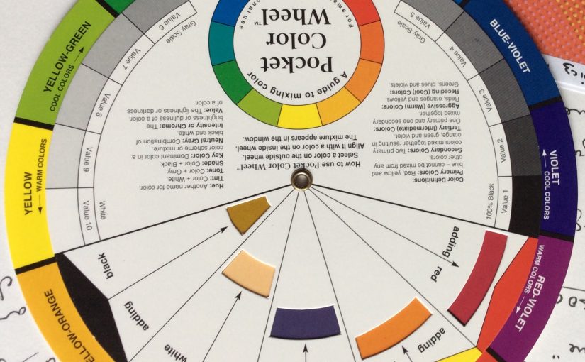
Wsetern colour theory was originally formulated in terms of three “primary” or “primitive” colours—red, yellow and blue (RYB)—because these colours were believed capable of mixing all other colours.
18th and 19th Centuries
The RYB primary colors became the foundation of 18th-century theories of color vision,[citation needed] as the fundamental sensory qualities that are blended in the perception of all physical colors, and conversely, in the physical mixture of pigments or dyes. These theories were enhanced by 18th-century investigations of a variety of purely psychological color effects, in particular the contrast between “complementary” or opposing hues that are produced by color afterimages and in the contrasting shadows in colored light. These ideas and many personal color observations were summarized in two founding documents in color theory: the Theory of Colours (1810) by the German poet Johann Wolfgang von Goethe, and The Law of Simultaneous Color Contrast (1839) by the French industrial chemist Michel Eugène Chevreul. Charles Hayter published A New Practical Treatise on the Three Primitive Colours Assumed as a Perfect System of Rudimentary Information (London 1826), in which he described how all colors could be obtained from just three.
Page from 1826 A New Practical Treatise on the Three Primitive Colours Assumed as a Perfect System of Rudimentary Information by Charles Hayter
Subsequently, German and English scientists established in the late 19th century that color perception is best described in terms of a different set of primary colors—red, green and blue-violet (RGB)—modeled through the additive mixture of three monochromatic lights. Subsequent research anchored these primary colors in the differing responses to light by three types of color receptors or cones in the retina (trichromacy).
For much of the 19th century artistic color theory either lagged behind scientific understanding or was augmented by science books written for the lay public, in particular Modern Chromatics (1879) by the American physicist Ogden Rood, and early color atlases developed by Albert Munsell (Munsell Book of Color, 1915, see Munsell color system) and Wilhelm Ostwald (Color Atlas, 1919).
20th Century
On this basis the quantitative description of the color mixture or colorimetry developed in the early 20th century, along with a series of increasingly sophisticated models of color space and color perception, such as the opponent process theory.
Across the same period, industrial chemistry radically expanded the color range of lightfast synthetic pigments, allowing for substantially improved saturation in color mixtures of dyes, paints, and inks. It also created the dyes and chemical processes necessary for color photography. As a result, three-color printing became aesthetically and economically feasible in mass printed media, and the artists’ color theory was adapted to primary colors most effective in inks or photographic dyes: cyan, magenta, and yellow (CMY). (In printing, dark colors are supplemented by black ink, known as the CMYK system; in both printing and photography, white is provided by the color of the paper.) These CMY primary colors were reconciled with the RGB primaries, and subtractive color mixing with additive color mixing, by defining the CMY primaries as substances that absorbed only one of the retinal primary colors: cyan absorbs only red (−R+G+B), magenta only green (+R−G+B), and yellow only blue-violet (+R+G−B). It is important to add that the CMYK, or process, color printing is meant as an economical way of producing a wide range of colors for printing, but is deficient in reproducing certain colors, notably orange and slightly deficient in reproducing purples. A wider range of colors can be obtained with the addition of other colors to the printing process, such as in Pantone‘s Hexachrome printing ink system (six colors), among others.
Munsell‘s 1905 color system represents colors using three color-making attributes, value (lightness), chroma, and hue.
Major advances were made in the early 20th century by artists teaching or associated with the German Bauhaus, in particular Wassily Kandinsky, Johannes Itten, Faber Birren and Josef Albers, whose writings mix speculation with an empirical or demonstration-based study of color design principles.
Itten and Albers studied the interaction between hues and the ways in which our perception of hues and tones is altered radically by the other colours surrounding them.
Impressionism
Pointillim
Fauvism
Expressionism
Alex Katz
Andy Warhol
Patrick Caulfield
Traditional colour harmonies
In reverse order of contrast:
Monochromatic
a single hue with its tints and shades produced by mixing with white, black (or its complememtary?)
Analogous
three or more hues that are next to each other on the colour wheel. Analogous schemes are most emphatic when the common hue is primary. They are most harmonious when the middle hue is primary (eg red-orange, red, red-violet rather than orange, red-orange and red).
Complementary
Double complementary
Split complementary
Triad
equidistant on the colour wheel. These result in a dominance of warm or cool.
Quadrad
where the hues are equidistant on the colour wheel.
Colour interactions
Successive contrast
Simultaneous contrast
Vibration where certain hues meet.
Bounding with white or black.
Disappearing boundaries: where analogous hues meet
Dissolving boundaries: where broken hues meet
This can be used to create mysterious effects. Or combatted using sharp edges.
Discords play a supportring role – they are easily overshadowed by colours that are not discorded, but they stop the tendency of hues to spread visually. Large areas in discorded colours should be avoided as they weaken a composition. But small areas reduce monotony. Light discors also produce the best highlights (because they are unexpected and attract attention??) The discord chosen should be based on the primary colour closest to the object featured in the hightlight, or the next closest primary on the coliur wheel.
When colors or shades of grey are sequenced in a composition eading from ligt to dark or dark to light then the eye is comfortable. But when the esquence is broken eg gray background, followed by white then black then the effect is jarring eg dramatic skies. El Greco View of Toledo.
Rhythm, repetition and movement
Repeating colours can lead the eye through a composition and create a sense of movement.
Emphasis can be accomplished by using colour in a number of ways
– colour contrast: bright/dull, light/dark, warm/cool
– area size: large areas of a colour versus small
– texture: rough versus smooth
– use of arbitrary colour
– unusual detailing
– contrast with surroundings
Harmony can be achieved through:
– repetition
– similarity
– use of tonality
– surrounding a colour with a neutral colour
Resources
https://study.com/academy/lesson/goethes-color-theory.html
Cambridge in Colour: Colour Management
Resources:
Cambridge in Colour: Colour Perception
Color can only exist when three components are present: a viewer, an object, and light. Although pure white light is perceived as colorless, it actually contains all colors in the visible spectrum. When white light hits an object, it selectively blocks some colors and reflects others; only the reflected colors contribute to the viewer’s perception of color.

Human Vision
The human eye senses this spectrum using a combination of rod and cone cells for vision. Rod cells are better for low-light vision, but can only sense the intensity of light, whereas whilecone cells can also discern color, they function best in bright light.
Three types of cone cells exist in your eye, with each being more sensitive to either short (S), medium (M), or long (L) wavelength light. The set of signals possible at all three cone cells describes the range of colors we can see with our eyes. The diagram below illustrates the relative sensitivity of each type of cell for the entire visible spectrum. These curves are often also referred to as the “tristimulus functions.”
| Select View: | Cone Cells | Luminosity |

![]()
![]()
Raw data courtesy of the Colour and Vision Research Laboratories (CVRL), UCL.
Note how each type of cell does not just sense one color, but instead has varying degrees of sensitivity across a broad range of wavelengths. Move your mouse over “luminosity” to see which colors contribute the most towards our perception of brightness. Also note how human color perception is most sensitive to light in the yellow-green region of the spectrum; this is utilized by the bayer array in modern digital cameras.
ADDITIVE & SUBTRACTIVE COLOR MIXING
Virtually all our visible colors can be produced by utilizing some combination of the three primary colors, either by additive or subtractive processes. Additive processes create color by adding light to a dark background, whereas subtractive processes use pigments or dyes to selectively block white light. A proper understanding of each of these processes creates the basis for understanding color reproduction.
 Additive
 Subtractive
The color in the three outer circles are termed primary colors, and are different in each of the above diagrams. Devices which use these primary colors can produce the maximum range of color. Monitors release light to produce additive colors, whereas printers use pigments or dyes to absorb light and create subtractive colors. This is why nearly all monitors use a combination of red, green and blue (RGB) pixels, whereas most color printers use at least cyan, magenta and yellow (CMY) inks. Many printers also include black ink in addition to cyan, magenta and yellow (CMYK) because CMY alone cannot produce deep enough shadows.
| Additive Color Mixing (RGB Color) |
Subtractive Color Mixing (CMYK Color) |
|||||
|---|---|---|---|---|---|---|
| Red + Green | → | Yellow | Cyan + Magenta | → | Blue | |
| Green + Blue | → | Cyan | Magenta + Yellow | → | Red | |
| Blue + Red | → | Magenta | Yellow + Cyan | → | Green | |
| Red + Green + Blue | → | White | Cyan + Magenta + Yellow | → | Black | |
Subtractive processes are more susceptible to changes in ambient light, because this light is what becomes selectively blocked to produce all their colors. This is why printed color processes require a specific type of ambient lighting in order to accurately depict colors.
COLOR PROPERTIES: HUE & SATURATION
Color has two unique components that set it apart from achromatic light: hue and saturation. Visually describing a color based on each of these terms can be highly subjective, however each can be more objectively illustrated by inspecting the light’s color spectrum.
Naturally occurring colors are not just light at one wavelength, but actually contain a whole range of wavelengths. A color’s “hue” describes which wavelength appears to be most dominant. The object whose spectrum is shown below would likely be perceived as bluish, even though it contains wavelengths throughout the spectrum.

Although this spectrum’s maximum happens to occur in the same region as the object’s hue, it is not a requirement. If this object instead had separate and pronounced peaks in just the the red and green regions, then its hue would instead be yellow (see the additive color mixing table).
A color’s saturation is a measure of its purity. A highly saturated color will contain a very narrow set of wavelengths and appear much more pronounced than a similar, but less saturated color. The following example illustrates the spectrum for both a highly saturated and less saturated shade of blue.
| Select Saturation Level: | Low | High |

![]()
