
Tag: designer
-
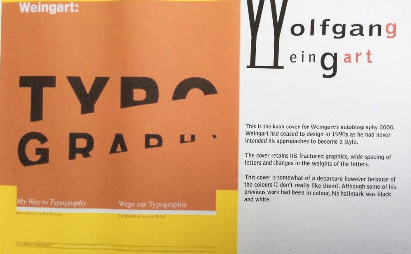
Wolfgang Weingart
Wolfgang Weingart (born 1941 in the Salem Valley in southern Germany) is an internationally known graphic designer and typographer. His work is categorized as Swiss typography and he is credited as “the father” of New Wave or Swiss Punk typography. “I took ‘Swiss Typography’ as my starting point, but then I blew it apart, never…
-
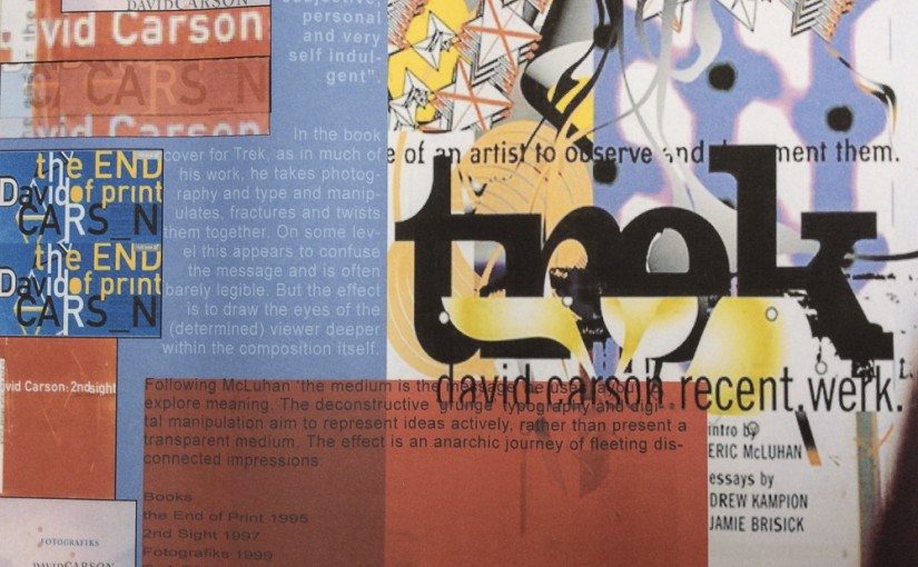
David Carson
David Carson (born September 8, 1954) is an American graphic designer, art director and surfer. He is best known for his innovative magazine design, and use of experimental typography. He worked as a sociology teacher and professional surfer in the late 1970s. From 1982 to 1987, Carson worked as a teacher in Torrey Pines High School in…
-
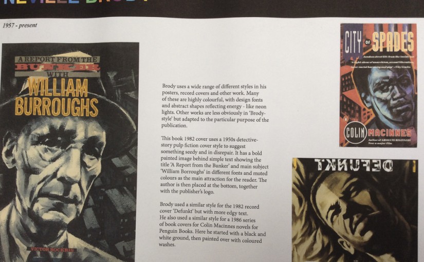
Neville Brody
Neville Brody (born 23 April 1957 in London) is an English graphic designer, typographer and art director. Influenced by Punk, Dada and Pop Art. He is the Head of the Communication Art & Design department at the Royal College of Art. In 1988 Thames & Hudson published the first of two volumes about his work, which…
-
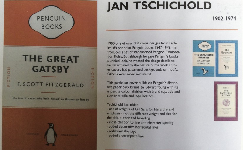
Jan Tschichold
JanTschichold (1902- 1974) was a typographer, book designer, teacher and writer. Modernism Tschichold became a convert to Modernist design principles in 1923 after visiting the first Weimar Bauhaus exhibition. He wrote an influential 1925 magazine supplement; then had a 1927 personal exhibition. Die neue Typographie Google images a manifesto of his theories of modern design and codified many other Modernist…
-
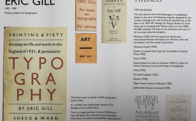
Eric Gill
-
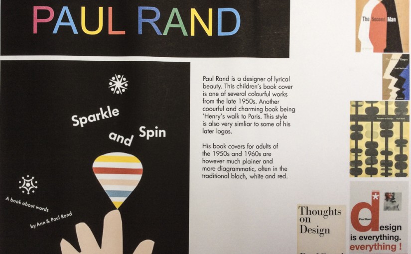
Paul Rand
-
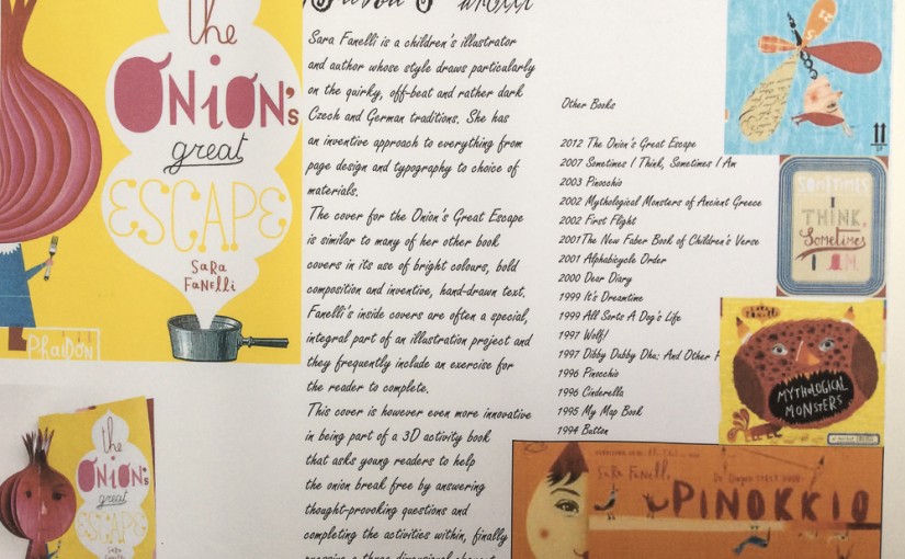
Sara Fanelli
-
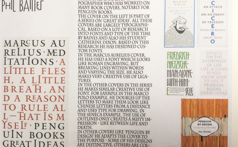
Phil Baines