
Assessment submission


The Brief
This assignment will allow you to put into practice what you have learnt in all the projects and exercises you have done so far, in particular your ability to work through the design process and undertake creative problem-solving in relation to a set brief.
Create jacket artwork for the Beat generation classic, On the Road by Jack Kerouac. The publishers, Viking Press, have decided to re-release this title in hardback form, and want a new jacket design to reflect the beatnik and avant-garde nature of this classic novel.
Requirements
Your design will need to include front, back, spine and flaps. You’ll need to source images, either from Bridgeman Art Libarary, Oxford Art Online, or create your own original imagery – illustration, photography or artwork. Base the dimensions of your jacket on a size of book that
you have available to you.
You’ll need to produce three different design versions and each will need to be mocked-up on a hardback book and photographed. Work through the design
process, documenting it in your learning log as you go:
• Ideas generation
Read the brief, identifying keywords. Generate thumbnail sketches to document and explore your thinking process.
• Research and develop ideas
Identify the research you need to undertake. This will include researching existing versions of this cover, and others of the same genre. This brief requires some lateral thinking; develop ideas that are unexpected, as well as the obvious.
• Present visual outcomes
Lay out the jacket using DTP software and incorporating text and image(s). Design three versions of the jacket. Print the jacket designs and make a mock-up of the jacket onto an existing hardback book. Photograph the book jackets as your final outcome to the project brief.
Cover Book Views 1 Wings


Cover Book Views 2 Pulp Fiction


Cover Book Views 3 Black City


With sketchbook. But unfortunately I do not have photos of all the sketchbook images that were considered – please see physical assessment portfolio.
Process
I began by listening to the audiobook many times while travelling, reading the book, watched the film several times and looked up background in Wikipedia and other book cover designs for the book. (see Sketchlog submitted as part of my assessment submission). I then started an A5 concertina cased Sketchbook – I chose this format because it could be opened out like continuous events along a journey. As I listened to the audio and read the book I copied out selected text that really appealed to me, or just drafted roughly images that came into my head .
My response to the book itself was very mixed. I did a detailed concept map (see first page of the Sketchbook) to try and capture and work through my very mixed responses. I really like the energy – and being ‘On the Road’ is something in my own soul. A passage that is often quoted is:
The only people for me are the mad ones, the ones who are mad to live, mad to talk, mad to be saved, desirous of everything at the same time, the ones who burn, burn like fabulous yellow roman candles exploding like spiders across the stars.
But I found the implicit and often explicit sexism not only of Dean, but also Kerouac himself, really got under my skin – so close to the sexism and prejudice that was all around me growing up.
Some of these images formed the basis of my original work sent to my tutor. In preparation for assessment I worked on many more images in the sketchbook and it was submitted as part of my portfolio, Unfortunately I do not have photos of all of this.
As my sample book format I wanted a small pocket size book – partly because that was the only size that would fit the whole spread on an A3 sheet on my printer. I chose a small volume on feminism – as a counter for my irritation with parts of the text.
I started with three contrasting designs: typographic, photographic and illustrative, but was not happy with any of them (see below). As I went back to the course to prepare for assessment – having completed by this time my Illustration 1 course – I worked a lot more on the sketchbook. I also looked back through my work on book covers and thought more about the types of covers I am attracted to – ranging from very bold and striking atmospheric images to ones that are more subtle with hidden meanings when you look more and/or once you know more about the book eg by reading the cover text and flicking through.
As a result of many new ideas, and suggestions from my tutor, my final covers are completely different from those originally sent. Some further ideas I worked on are also shown below. The final images are all from sketches I just enjoyed doing from the images that came into my head and/or the joy of experimenting with media like oil pastels, rather than the much more self-consciously digital compositions in the original covers.
Development of the final covers
In the order in which I developed them. I try to illustrate very different moods and interpretations from the book – focusing on what might attract modern readers – as per the brief.
Cover 3 Black City

Cover 3 Black City was my first new idea, developed from my original dark text image and road cover ideas, trying to achieve a similar feel of darkness and fractured movement – maybe ‘big brother watching’. The treatment is expressive, trying to attract the reader with a bold contrasty image and distinctive style.
The text on which it is based is : “The whole mad swirl of everything that was to come began then; it would mix up all my friends and all I had left of my family in a big dust cloud over the America night”
The sketch itself was done through scraping oil pastel (the photo is too shiny). I really like the strange ghostlike fingers of the city, and the sharp lines of the road – like death madly going nowhere. But it also looks jewel-like like American skyscraper cities from a distance. I also drew on underlying ideas from my original typographic and photographic covers.


I then developed it through duplicating, cropping, transforming, layering and blending in Photoshop. Trying to enhance the mood and experimenting with different relationships between foreground and background – and making interesting discoveries along the way – like how there seems to be a wing mirror like the original cover, but produced accidentally from the way I had erased the gap for the text and then blended the images. I tried to retain this, but in the end it disappeared in the final blending.


Finally I looked at typeface and colour and position of the text. I chose Gill Sans as a 50s-style typeface that Kerouac would have had access to – other options like Courier and typewriter fonts did not get the feel I wanted. My first version had a sort of mushroom brown colour taken from part of the image. Then I tried blue colour and my family’s consensus was for the blue. I also tried the condensed Gill Sans, but this left too much space – I also tried with a black background behind the text (above).

The final version has lined the text along one of the road scratch lines, and lined up the title and Kerouac.
Cover 2 Pulp Fiction
This cover was a second parallel idea – developed from one of the few passages in the book that could speak to a modern more feminist audience. It is more of a narrative treatment that suggests a story through juxtaposition starting with the text:
“Boys and girls in America have such a sad time together; sophistication demands that they submit to sex immediately without proper preliminary talk.
Not courting talk – real straight talk about souls, for life is holy and every moment is precious.”

It is a composite of a number of different images from my sketchbook, charcoal, pencil and crayon, including some of Marilou that are not shown here. I tried combining sone sketches in different ways around a narrative reflecting the text – also juxtaposing the very varied attitudes of Sal in different parts of the novel. He often blames Dean, but he himself is extremely patronising and often uses women then just leaves – not like the text.


For the text I used Courier new – like the typeface that the original is in – as a Pulp Fiction dime novel. Because of the textured drawing It was a challenge to both tie in the colour using colours from the image and make it stand out through layering, bevelling and embossing. I like the textured effect here. I also lined up the title on grid line with the girl’s mouth – not obvious, but I think it adds a bit of intensity – as if she might speak.
Cover 1 Wings
This came from a completely new sketch in oil pastel and graphite of some text near the end of the book where Dean’s energy has nearly sent him mad.
“I saw his huge face over the plains with the mad, bony purpose and the gleaming eyes; I saw his wings. I saw his old jalopy chariot with thousands of sparking flames shooting out the front. I saw the path it burned over the road…Dean had gone mad again”

This is another bold, contrasty expressive approach, aiming to attract the reader by a distinctive image style. I was playing around with bold shapes and lines across the page on this one, enjoying the oil pastel. I liked the coloured and textured effect I got – particularly when it was enhanced with a generous dose of fixative. Also the scratched out name.


Here I decided to retain the hand written text, but cut and paste it in Photoshop, and further enhanced the colours through layering and hard light blending. I think this is the most dynamic and energetic and unusual of the three covers, and for that reason my favourite.
My initial submission to my tutor
Initially I intended to try three approaches to cover design;
- text-based – inspired by David Carson
- photographic – inspired by Lee Friedlander and Robert Frank
- illustrative – inspired by Saul Bass


Photographic – inspired by Lee Friedlander and Robert Frank
Some other more recent ideas
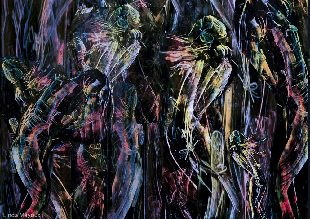
From other sketchbook images that I enjoyed doing
Idea 1 loneliness and emptiness of the road. Like Motherwell, also drawing on the Friedlander image my tutor liked. I discovered what could be achieved just by cutting and layering ie the hill is just made up from that. Done in Procreate on my iPad from the original plain ink and brush drawing.


Idea 2: darkness of the road coming between two friends.


Idea 3: the brilliance of Mexico and sunsets
The sun goes down long and red…soon it got dusk, a grapy dusk over tangerine groves and long melon fields, the sun colour of pressed grapes, slashed with burgundy red, the fields the colour of love and Spanish mysteries. I stuck my head out of the window and took deep breaths of the fragrant air.


Idea 4: energy of jazz
I really like this original oil pastel drawing and enjoy this gestural type of work using a credit card to scrape through different pastel layers. I then cropped, cut and blended with different colour versions in Procreate on my iPad. But this still needs a lot of work to really bring it together for a cover – I was not sure where to put the title and text.


