
In producing the images and selecting the original illustrator files I had had in mind a narrative of an ‘anonymous’ individual seeking hard to find their identity in a crowded and competitive world where advertisements are always trying to make people feel inadequate in order to buy products. Those who are not able to cope with these pressures are given very little help, and often descend into serious mental health problems. My images are informed by novels about experiences in mental health institutions like Janet Came’s ‘Faces in the Water’, also the experiences of people I know, and my own experiences of depression.
A clearer narrative was forming itself as I selected the Illustrator images – how might things start? happy? depressed? would it have a happy or sad ending? how might the highs and lows be sequenced? how many? I experimented with different arrangements of the images, how would different colour combinations work on a spread or over several spreads?
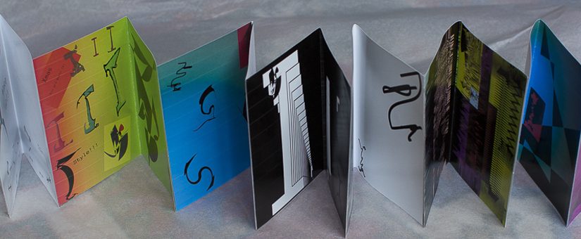
Narrative so far – initial concertina mock up
Version 1 – initial explorations.
At this stage I was just looking at selecting the shapes I liked, seeing how they might be combined on a page for a narrative over the 16 pages, and exploring possible emotive colours. Please note – not all the colours and effects translated from the illustrator files imported into InDesign, then exported direct to Acrobat. eg the Vortex image. This is not only because of CMYK shift, but also the fact that some blend modes do not transfer well – at the end I need to convert to jpg. But at this midway stage, I need direct access to the illustrator files from InDesign.
Version 2 – clearer narrative and revising the colours into spreads for concertina mockup
As my work on Projects 2 and 3 progressed I was starting to think about the collating and binding for the final narrative – as this also affected my selection of images, the colours I might choose as a sequence etc from my more free and random experimentation. I wanted to do something a more exploratory for this project than a straight booklet – I thought of possibilities like:
Ten Thousand Stories: An Ever Changing Tale of Tragic Happenings by Michael Swanson and Robbi Behr where the page is cut into 3 as a mix and match where different combinations of the written and graphic page elements make different stories.
Couleurs du Jour by Czech author-illustrator Kveta Pacovska. It’s filled with pop-ups and subtle changes in texture on the pages, with openings in some places that offer glimpses of parts of the reverse. It can be opened at random and flipped through or all stretched out.

I had started to experiment with this type of concertina format with my Sketchbook ‘On the Road’. Other examples can also be found at http://paperchipmunk.com
I printed out each spread on everday photopaper and joined the spreads into the concertina with sellotape.

But I changed some of my initial sequencing in the pdf – I put the vortex spread after Xmas to give a better rhythm of colour and black and white. This makes the black images really stand out as a low point. And then reversed the two Crazy images to become more crazy and coloured.
Version 3 – concertina narrative
After I pasted things into the concertina, I saw the possibility for increasing the linkages between the pages as a sequence, rather than individual spreads. This led me to revise the Illustrator pdf:
- I removed a lot of the text, and put You’re Worth It to the end.
- I made all the styles follow on from each other from one spread to the next. I made the insect from page 4 then lead into p6. The little diving image at the top left of p11 comes as variant of the praying image on p10
- I further adjusted the colours to follow on.
But as noted above not all the colours and blend modes translate from Illustrator via InDesign to Acrobat. eg the title page is white, not black, the colour on the vortex goes dark from the blue on the previous page, and the little ‘baby’ on the lap of the mother in ‘calm’ is a more brilliant red.
Idea for binding 1 : Cyclical Narrative ‘back to square 1’
Once I had the concertina, then I started to think of ways to do a more convincing binding. An obvious idea would be to make it a cyclical wheel – gluing and stitching the pages back to back. This would imply a narrative where the same patterns repeat themselves – this would require making the Title page and the final page lead back into each other.

Ideas for binding 2 – The Savage God narrative of the world outside
I also got an idea for how to join the spreads without sellotape – if I put further alternating spreads on the back so that they reinforced each other. Some of my inspiration for this piece had come from Alvarez Savage God – an old secondhand version of this had provided some of the text behind the images. So I looked through the book and found excerpts from poems and texts that I thought would complement the images. My idea is that the lines look like arrays of marching people and buildings on the outside of the inner turmoil. The text can be ‘anthropomorphised’ by changing its size, orientation and positioning on the page.


Savage God Backing_mockup text pdf
So far I have only started to work with this idea and it needs a lot more work:
- how should the text itself be sequenced? should its meanings follow or challenge the pictorial narrative?
- should the text also have images to enhance the pictorial appearance and meaning of the text? or coloured backgrounds?
- what sorts of paper should be used?
- should some images or texts be cut through as in the Pakovska book?
Reflect, evaluate and rework the images
By the At this stage I compared the different images to see whether I thought that the original straight illustrator files or the ‘happy accident reworks’ were more successful. I was asked to consider:
- Which pages are successful?
- Which pages have not turned out as well as you had hoped?
- Are there any visual surprises, or happy accidents?
- which ones did I rework
Title Page
This title page still needs a lot of work – I need to be clearer what the aim is. I was trying hard to get a cold frosty dead look of someone too numb even for dark depression. But I need to think about this much more.

2/3 Wake Up
Here I used Photoshop to edit the soft silver images, then composited in InDesign. Unfortunately although the image looked good in InDesign – a much more subtle image – it did not export from InDesign to jpg without the horrible splurge. I need to go back and composite the whole thing in Photoshop.


4/5 Xmas
Here I tried adding the ‘feelings’ images underneath the original Illustrator image – the gloopy sheep providing a spur for the style experiments, and the image with text counterposing the flight. I quite like this – but should tone down the black image at the back.


6/7 Vortex
In the Vortex images I liked the addition of the transparency to give more of an idea of swimming and drowning to the image on the left, and greater depth – enhanced by blend modes in InDesign to the image on the right.


8/9 Dark Place
I liked the starkness of the original black image, but compositing and blending with the text and smeared images gives greater depth and mystery. Also the straight image did not sit so well with the other images now they have been composited with more texturing and layering.


10/11 Prayer
In this image also I liked the smearing on the transparency slide, but did not feel the text fitted so well. Nor did I think the transparency image of the boat and sea really fitted – I preferred the moonlight image. I layered the transparency on top of the straight Illustrator image to give a more smudgy feel.


12/13 Crazy
In these images I decided to go for the brighter crazy/jazzy image. I used an Exclusion blend modes to emphasise the small diving figure top right as much as I could. Not sure if anyone would notice it though. It is supposed to be small and I do not want to make it much bigger.


14/15 Calmer
Here I softened the image by duplicating and overlaying to make it less brash – calmer and a bit more comforting Mother and baby.


16 Your’re Worth It
In this image I am not sure how bright to make it – it is aiming to be a sort of resolution – but still very swimmy and strange. Not normal after all the turmoil. At the same time a bit comic – maybe emerging?


Current State of the Project and Questions
I currently have a number of different versions:
- The straight Illustrator version
Printed as a Concertina on Everyday Photo Paper as my first mockup. I quite like this version – but maybe it could be printed even smaller. Possibly as a series of squares like a comic strip, or with see through windows like the Pacovska. With a bit more editing and thinking about colours. I do not think this would work so well with the text on the backing, so I need to think about something more inventive with the binding. I need to think particularly about the title page.
Anon3
2 The Layered Image Version
This works better I think at this size and format, ant with backing text. But I need to think more about what types of papers I will print it on. And how to do the text. I also need to redo some of the images in Photoshop so that the jpgs have the right blending. Again I need to rethink the title page.
Anon4
