
TASK
Using a single typeface of your choice, lay out the following text in as inventive a way as possible . It is important that you play with the text, with individual letters and words. Experiment with the letters and words to significantly alter the arrangement of the text, its rhythm and readability. How experimental can you be in making expressive typographic designs? Can you reveal something of the character and nature of the letterform by experimenting with scale and orientation, so a simple unassuming letter becomes a monumental, almost sculptural form?
Read the text through once before starting to manipulate the type. Make several designed versions of this passage, or parts of it, spanning several pages if need be.
20,000 Leagues Under the Sea, Jules Verne
Chapter 1 A Shifting Reef
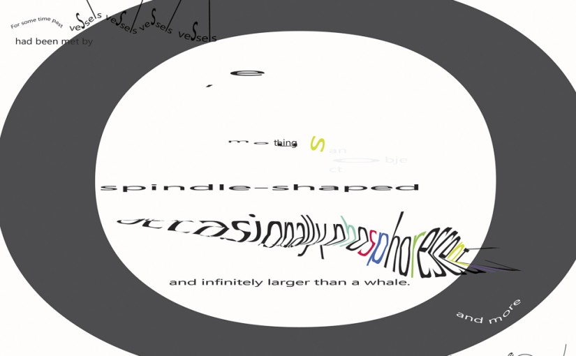
The year 1866 was signalised by a remarkable incident, a mysterious and puzzling phenomenon, which doubtless no one has yet forgotten. Not to mention rumours which agitated the maritime population and excited the public mind, even in the interior of continents, seafaring men were particularly excited. Merchants, common sailors, captains of vessels, skippers, both of Europe and America, naval officers of all countries, and the Governments of several States on the two continents, were deeply interested in the matter.
For some time past vessels had been met by “an enormous thing,” a long object, spindleshaped, occasionally phosphorescent, and infinitely larger and more rapid in its movements than a whale. The facts relating to this apparition (entered in various log-books) agreed in most respects as to the shape of the object or creature in question, the untiring rapidity of its movements, its surprising power of locomotion, and the peculiar life with which it seemed endowed. If it was a whale, it surpassed in size all those hitherto classified in science.
(My initial emphasis added)
Research
Think about design group Tomato’s definition of typography – ‘Sound as form’ – and how this concept might apply to your own work. Use the content of the text to inspire visual ideas. How might you experiment with the type to communicate something of the essence of the descriptive content? Think about how the designers you researched in the previous section, e.g. David Carson and El Lissitsky, would approach the text – or artists like Marinetti and Schwitters.
20,000 Leagues cover examples give some ideas of writhing tentacles and ships, also possible colours.


Versions developed so far in Illustrator
Tomato/Marinetti


El Lissitsky (to be done)
Philippo Marinetti (more to be done)
Kurt Schwitters (to be done)
I plan to draw some versions freehand first and then transfer to Illustrator. Instead of starting digitally in the first place. I think that will give more fluidity and impact to the final design.
